


In today’s fast-moving digital world, we can’t assume the power of having a solid online presence for your business. With 97% of prospects learning about business existence online, you need to position your law firm’s digital home rightly. A law firm website is a necessity.
But not just a website. You need the best professional law firm website. With that, you get to reach and convert many prospects, position your firm as the best in your legal specialization and showcase your brand values to help win and retain visitors while boosting their trust in your services.
In this post, we’ll focus on 50+ best law firm websites and expound on what makes them exceptional to inspire you as you plan to have a great law firm website. More so, we’ll give you tips to design or improve your already existing website for maximum performance and quality results.
We’ve analyzed multiple options and listed your favorite go-to sites taking the legal industry by storm. With up to date designs and some excellent concepts about these websites, you’ll learn a few things from them to help you build a great site. Let’s get started.
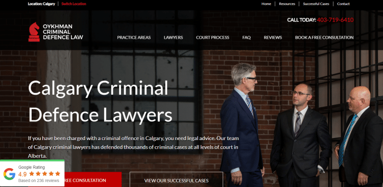
Oykhman Criminal Defence Law is the top contender in our list of the best law firm websites. You’ll love everything about this site. Even when you’re seeking a criminal defense lawyer for the first time, the website has an inventive menu to help you.
There are contact details on every page to attract client engagements, the interface design is incredible for mobile and desktop use, and every content appears optimized. We love the color scheme, free consultation aspect, and their success stories.
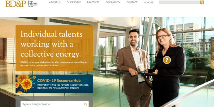
BD&P law firm sends a very coherent message to prospects. Its approach to attract clients is simple yet actionable. They have embraced quality photos with high resolution within their simple website interface.
The first bold statement that you read on the homepage shows that the BD&P lawyers are focused and work together. Again, you can search for a lawyer or legal practice area on the site, saving the visitor’s time.
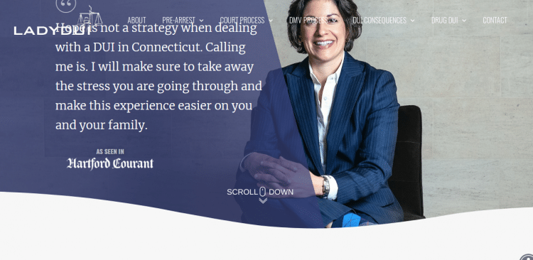
The first thing that captures your attention is the background photo of smiling DUI attorney Teresa DiNardi. You’ll also notice that her suit complements the website’s theme, bringing about a perfect website pattern.
The positioning of the call to action and the categories’ arrangements in the menu make the website easy to navigate. With that, legal prospects can reach out easily without any stress.
If your goal is to have one of the best law firm websites and you’re a solo practitioner ready to showcase your expertise and beautiful background, then LadyDUI’s website is an excellent choice to borrow ideas from.
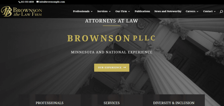
You don’t need a complex color scheme to have a classy website. Brownson shows it as it is. They’ve leveraged a great color but with minimalism and simplicity to ensure everything falls in place.
You can also learn from Brownson the perfect positioning of the call to action, a clear indication of the practice area, and being open about the location. Showing their professionals and services give clients a chance to know what they expect.
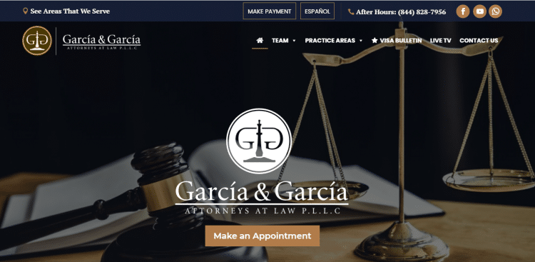
Browsing a legal website doesn’t have to be boring. We understand that some prospects are desperate and in a dire need for legal help, but scanning a clean law firm website like Garcia & Garcia cools them down.
The design and simplicity of the features and colors make the site appealing. We can’t forget to appreciate their clear call to action and some fun animations that make the website lively as prospects browse in search of a few things.
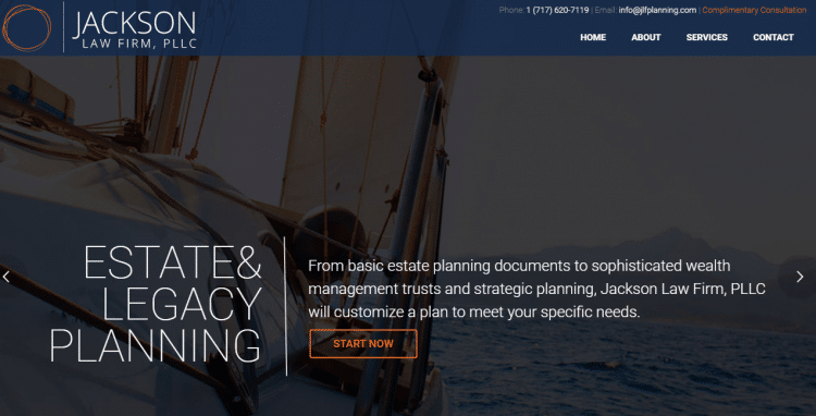
Jackson Law Firm deals with estate and legacy planning, and that’s one of their main features on the homepage. The firm states that it can handle even the most complicated tasks in a customized approach.
With that, you get to know what awaits you, even before you hire the firm. The beautiful image adds a refined touch to the site. The placement of call to action across various pages on the website ensures the clients don’t struggle to get in touch.
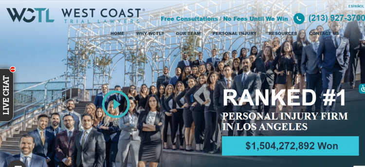
We have all the reasons to mention West Coast Trial Lawyers as one of the best law firm websites. First, the site has maximized its homepage without looking overcrowded.
At the top corner, it gives you an option to translate. Below that, there is a call to action that lets you know that consultation is free, and you don’t have to pay until you win. More so, you can call via the number indicated.
The WCTL firm general website is easy to navigate, whether on phone or desktop. With a bright background, Yelp and Google reviews, and statistics that indicate how much they’ve won, prospects get an assurance of quality representation.

Roys Law, as their tagline reads, is truly the life of the law. The firm has invested in its online presence with a fantastic website. Three things set the Roys Law website apart: good looking visuals, engaging content, and beautiful images.
In a modern setting where content is king, the websites get to tell as much as possible through engaging copywriting. More so, the news, events, and resource hub have most of the things every legal client will want to know.
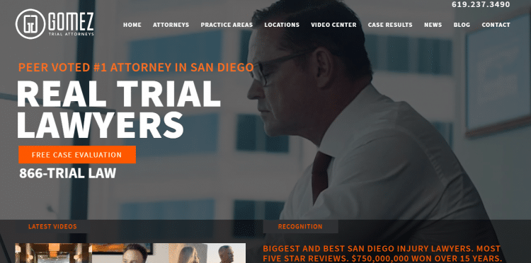
Gomez Trial Lawyers refer to themselves as the super lawyers or best lawyers when it comes to real trial cases. Well, that exceeds the office work and court presentation. They have a perfect website with a modern style that many would love.
The site presents itself as being real to win clients’ trust. With quality lawyer images at the homepage and awesome videos related to a few law firm issues and a blog, prospects get to know a lot before closing a deal with the firm.
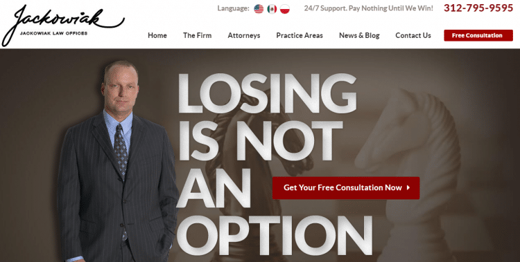
The injury lawyer website has powerful phrases that will draw the attention of most prospects visiting the site. For instance, the bold white statement that reads 'losing is not an option' indicates its seriousness in practice. Other enticing phrases include Pay nothing until we win, and get your free consultation now!
With a desire to serve many prospects anytime they want to seek injury lawyers' guidance, the firm has incorporated translation, 24/7 support, and educational news and blog, among other sections.
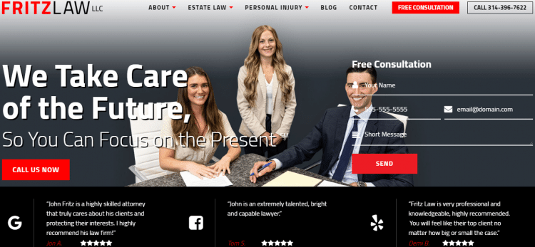
There is always something that prospects are looking for any moment they seek legal services. Fritz Law LLC doesn't frustrate. Other than a perfect presentation, its valuable content stands out.
Through reviews that build clients' trust, genuine social media profiles, and contact sections to help get in touch with ease, the websites attract and convert many visitors. Down the page, Fritz Law LLC explains who needs their services and why customers need to prefer them over competitors.
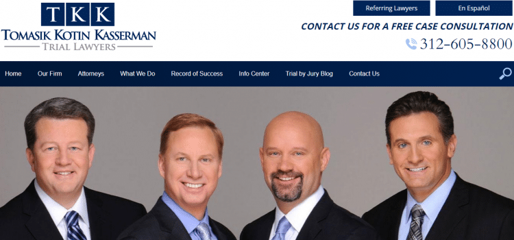
The TOMASIK KOTIN KASSERMAN law firm puts the three legal minds behind the company on the front page. That's a great way to establish good trust with their clients. The trial lawyers' smile tells that they're happy assisting prospects that seek assistance in personal injury.
The site is mobile friendly and perfectly optimized, with so much to know about the firm practitioners, success stories, etc. There is a clear call to action and LIVE CHAT to engage prospects who have questions about the firm's practice.
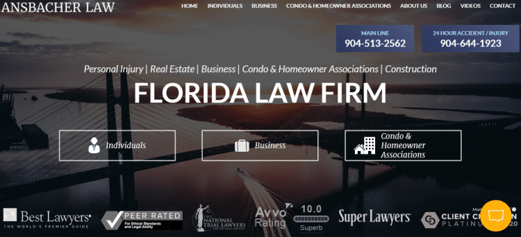
The Florida based law firm focuses on real estate law. The site mobile and desktop speeds are incredible. Prospects get to browse the website pretty fast without wasting their precious time.
In this site, the headline 'we get deals done' captures the prospects' attention, even before looking at other parts. Considering that the firm focuses on real estate, the background interior is a plus, not forgetting the perfect color contrast.
Ansbacher Law separates its practice areas into various categories to solve the particular needs of their clients. More so, the firm lets the homeowners, businesses, and individuals know their location for convenience purposes.
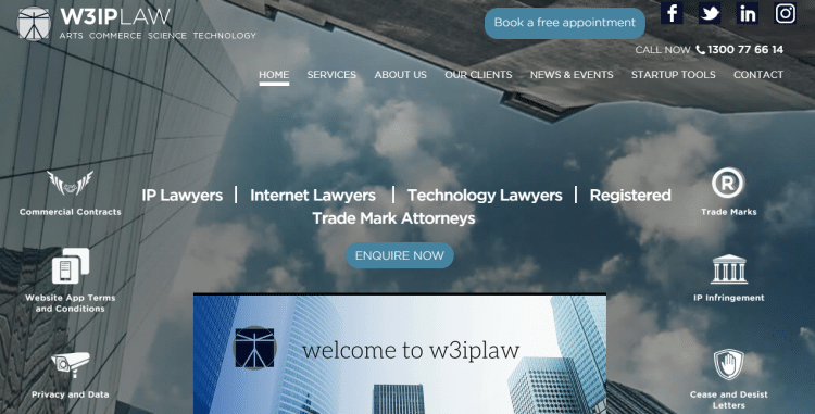
Though W3IP Law's main concern is on digital and intellectual property law, they've comprehensively utilized the homepage as much as they can to show the particular areas they can help.
Through the three primary navigation cues, prospects get to commercialize, respond, and protect their particular requests or ideas. The IP, Internet, and technology lawyers await your request. The site's left and right side also tell you more about the law firm's position in providing legal services.
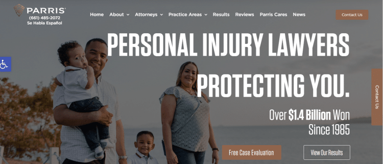
Parris is a California based personal injury law firm that doesn't need a lot of introduction. While people know its outstanding services, their website also complements the firm's high standards.
You'll notice that Parris uses photo images of its practitioners in the background to show that they're proud of their team and, at the same time, build trust in their new and returning clients.
Again, you can easily search what you intend to know. In case a prospect wants to contact the lawyers directly, there is a Live Chat at the right corner and other contact options on every page.
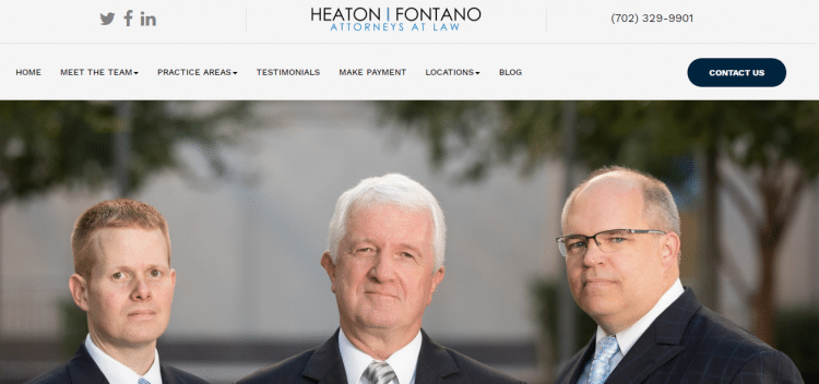
Anytime you figure out about starting or improving your law firm website, something like the Heaton Fontano firm website should come to your mind. It's a perfect example of how modern law firms need to appear.
The background headshots attract the audience and convince them to the maximum even before browsing further. The easy-to-follow website, color scheme, areas of practice, and website layout show that the firm has done much more than its competitors.

Madison Marcus Law Firm falls under the best law firm websites for a reason. The site is quite dynamic, with many attractive, convincing, and professional features.
The site has no irrelevant content. You only find what's helpful for your situation, and that saves time. There is also a beautiful homepage background, perfect video, and extensive use of animations to enhance its beauty and understanding.

Much law is a convincing site that does all it can to let clients know that they're the best in the legal sector. If you intend to win legal prospects easily, you have to tell them what they anticipate to hear, and of course, deliver in return.
On this site, you'll first get attention from the team pictures. More so, the firm tells you why you need them and goes ahead to explain their availability. They even prompt you to watch a video, and in the end, you'll become convinced fully.
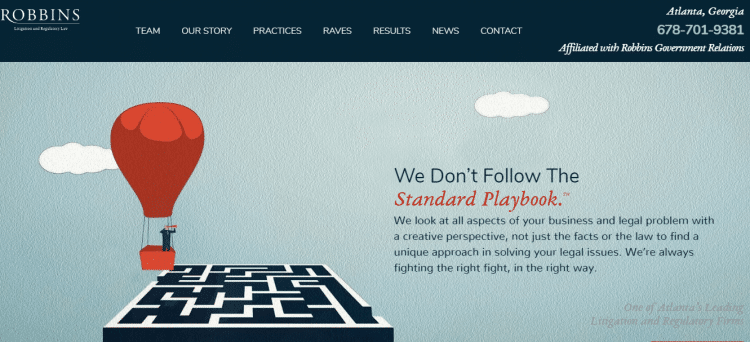
Robbins Firm has a creative website worth our attention. Browsing the site, you'll realize that the litigation & regulatory law firm has creative visuals in the background.
The statement 'We Don't Follow the Standard Playbook' tells a lot about how the firm handles your legal needs. It focuses more on your rights and embraces a perfect approach to have your issues solved.
The website shows how a firm that has served multiple clients and achieved excellent results can incorporate a perfect copy and success stories in the site, without creating negative perception.
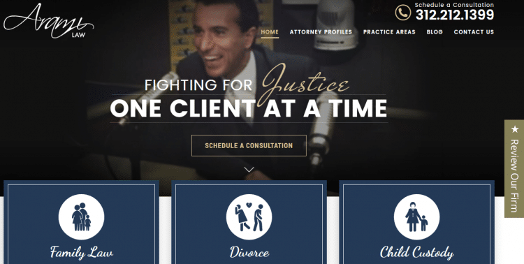
People believe in a law firm's capability to handle their case once they read the customer testimonials. Some firms ignore this section, not knowing its importance. Research evidences the effectiveness of testimonials and case studies.
Arami Law Office is among the best law firm websites on our list with a perfect presentation of testimonials. The law firm website shows testimonials on the front page, and more so, there is a solo page dedicated to that purpose.
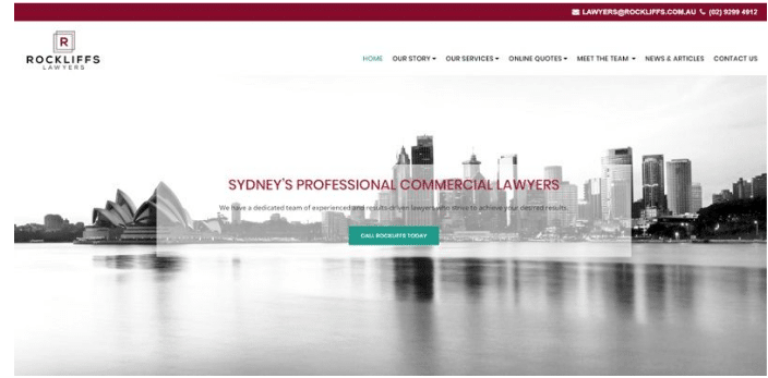
Rockliffs Lawyers firm has a welcoming site and good looking professional logo. What excites us most about this site is the concentrated focus on the call to action. Whether it is at the top right where they've indicated the email or at the center section, Rockliffs Lawyers let you know that you can contact them anytime.
Something unique about the website is the impressive aerial shot that shows the beauty of where the company operates. The website captures the attention of prospects looking for commercial lawyers pretty fast.
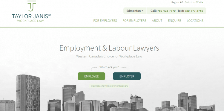
Taylor Janis LLP Workplace Law centers on employment and labor law. The firm makes a straightforward statement on its homepage. From that, you can know the practice area and the location it serves (Alberta, Canada).
The quick start gives two options, the employee resources and the phone contacts, each with unique colors. But the reality is that the contact information color draws greater attention.
While the design is simple, the site has most details every prospect in need of employment and labor law services would want to know.

Mission Counsel KC positions itself as a business and nonprofit law firm, serving prospects in Kansas City. The thought-out color scheme, photography, and parallax lines that look similar to those in a logo show the law firm creativity, uniformity, and dynamic approach to legal work.
There is a touch of minimalism, with only four categories in the menu bar. Still, the law firm provides a section of 'who we are,' the practice areas, and how they carry out their work to give clients prior information before they contact the firm.
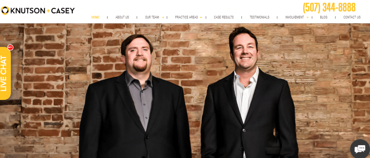
Knutson + Casey website looks simple, yet it accommodates a lot. They understand that prospects want to work with a cheerful team focused on their requests. The firm is proud of what they do, and it's clear in the background image and the statement 'award-winning Hometown attorneys.'
That's not all. The site is readable with sizable fonts, not forgetting the proper utilization of the website space. The free consultation, live chat, and available contact details at the top right of the websites aim to attract interested clients.
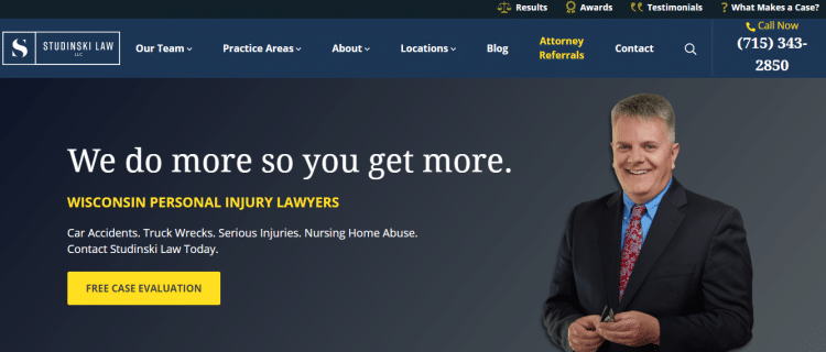
Issues to do with personal injury require a law firm to work more to win a prospects case. Studinski Law, LLC, cognizes that their high font declaration that appears at the center of their homepage indicates their aggressiveness.
Again, the excellent design, good site speed, lovely interface, and perfect color combination transform the site's look for the better. The live chat and contact details on the top right make the site accessible for free case evaluation and representation.

TSMP Law Corporation’s website is another simple site in this best law firm websites list. The background media makes it quite attractive, courtesy of Stephanie Yuen, the main figure in the TSMP.
As a brand to this law firm, Stephanie gives the prospects the reason to trust the firm’s legal services on securities, finance, and corporate regulations.
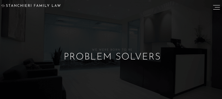
You might think that Stanchieri Family Law has less to offer due to its simple homepage. The truth is that it has a lot for clients seeking family law services. It embraces the ‘less is more’ approach.
With clients searching for a trustworthy law firm, the center profile with excellent photos of the firm attorneys creates a feeling of togetherness in the firm, enhancing clients’ trust.
The law firm goes beyond that and indicates a clear call to action, case studies, core values, legal fee calculator, and a detailed footer to inform their prospects further.
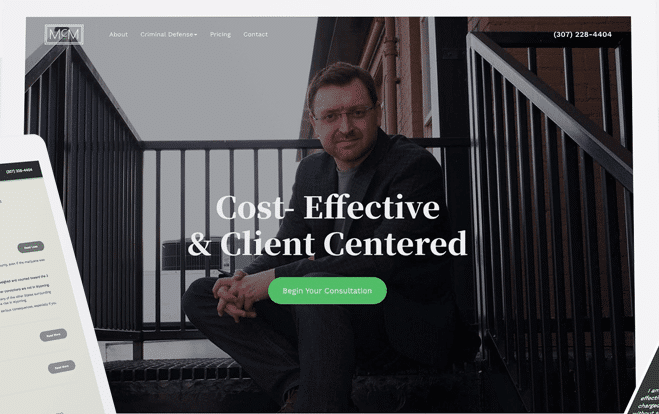
SMCM Law is a good example of how you can match professional photography with your law firm website to develop a simple, effective, and yet one of the best law firm websites in the current legal era.
The full-screen header gets straight to the point. We also love the bold statement ‘Cost effective and client-centered’. If you’re looking forward to having a solo firm, you can borrow a thing or two from its general structure.
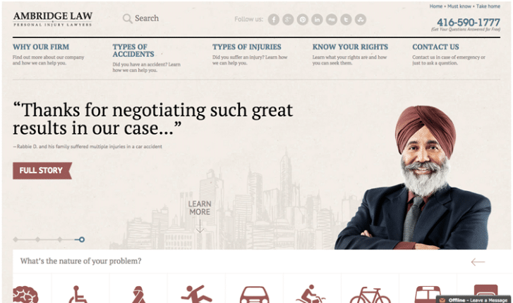
Personal injury lawyers are many out there, and to stand out, you need a great website that gives prospects a reason to contact you and not your competitors. Ambridge Law prioritizes on educating its prospects beforehand.
That’s why the site has an exceptional and educational menu. With detailed information on why you need Ambridge Law to the types of injuries and accidents, and more so, educating you about your rights, you can’t doubt their legal prowess.
Again, the website has maximized its presence across social media platforms. It also documents each case attended in a story to show their capabilities in handling personal injury cases.
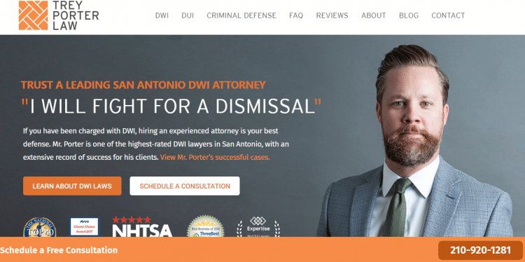
Trey Porter Law’s simple website gives a convincing assurance the first time you browse it. They promise to fight for a dismissal, something every client with a DWI, DUI, or criminal defense wants.
With the website showing some of the awards the firm has acquired, prospects do not doubt that Trey Porter is surely a leading San Antonio DWI attorney. The site goes ahead to educate visitors through their FAQ section and blog.
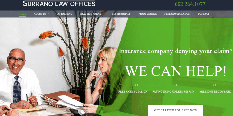
There are things you highlight in your law firm website, and you get the assurance of converting visitors that browse your site. For instance, free service and assurance of help irrespective of the current situation.
The Surrano Law Offices is a master in this game. They promise free consultation, which is an enticement to draw clients close to them. Other than that, their statement ‘WE CAN HELP’ gives hope to clients that they’ll win the insurance claim.
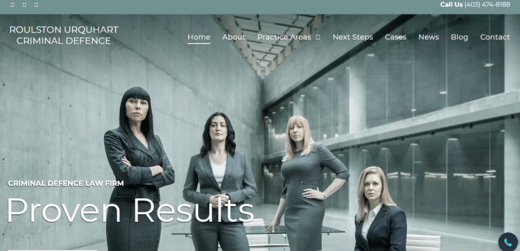
The criminal defense law firm assures clients of proper presentation through its bold decree that reads “proven results.” The website instills confidence in prospects allowing them to contact the law firm for legal services. Keenly look at the ladies in the background, and you’ll see their seriousness.
The attorneys are ready to commence your case. Their bio evidences their practicing strength. That’s what everyone would want when looking for a criminal defense attorney. For a uniform color pattern, the attorneys’ corporate uniforms match the website theme. Matching extends to other website pages.

Turks Legal intention is very clear. The firm wants to win the prospect’s trust across various practice sectors. That’s why they have authoritative images of their legal practitioners at the homepage, and more so, they’ve focused on the insurance, commercial, and banking sector.
The website design is simple, with a clear call to action. The firm site avoids many colors to maintain a minimalist look. The lawyer’s background image matches well with the rest of the site. That’s a catchy bait to impress and create attention.
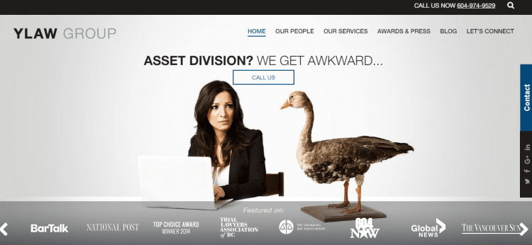
The law firm specializes in family law services handling cases like custody and divorce. These services are not a walk in the park, and they can stress the victims. YLAW Group takes the responsibility, and they promise to get what you want, even if it’s an asset division.
The background, website layout, and inclusion of contact details at strategic positions set the website apart. The firm has also scored well in making the website easy to navigate. The website has featured the publications at the lower section where it has appeared to boost its credibility.
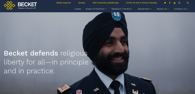
Becket law firm defends religious liberty for people with various religious beliefs. With details on cases, relevant research, and more on religious practice and principles, clients have a lot to learn. The attorney website is vibrant in its design about the dedication it has to serve its prospects.
The background image and color perfectly reflects the law firm philosophy. Clients can easily navigate this simple and elegant design. We also love the fact that the website has contact options with charming colors that draw attention.
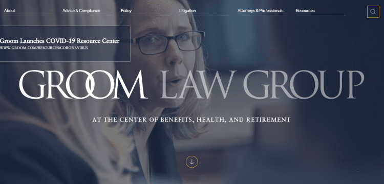
Groom Law Group maintains a simple look and features while maintaining relevance and ensuring prospects know what the firm concentrates on most. The firm lets prospects know that they deal with benefits, health, and retirement from the homepage.
The simple and uniform color design, resourceful and well-arranged menu categories, and a search feature reflect the law firm's commitment to fully informing the clients about their needs and solving their issues.
It feels frustrating when you can't find what you're looking for on a law firm website. That happens not because the site excluded what you want, but the general layout makes it hard to navigate.
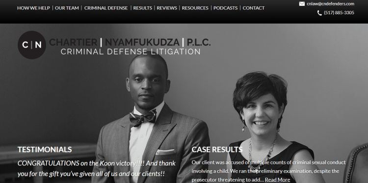
Chartier & Nyamfukudza, P.L.C. is clear on their devotion to criminal defense litigation. Besides the smiley background images and previous clients' testimonials, the site has a very convenient menu that's quite convenient to scroll. Prospects can easily navigate and find what they need at the moment.

Axiom Law though it involves various lawyers that individuals can choose from, it's worth mentioning. The site design is straightforward and unique. Axiom is known for providing solutions to clients that require business law services.
The user interface and orange logo add extra flavor to the website. The menu that lies on a white background looks simple, but browsing the options, you realize that the future of law is at Axiom, just like its mission statement dictates. There is much that awaits businesses and individuals here.

While some law firm websites prefer to have the staff or personal photos in the background, Randal Lowry and Associates firm has taken a different approach. The rhino photo in the background, coupled with the statement 'Divorce Can Be TOUGH' but so are we! Shows firm dedication and aggression to divorce cases. That gives divorce prospects trust in the firm's legal team.
We can't overlook the creative color combination that makes the site outstanding. Again, even when prospects seek divorce services for the first time, the menu has everything in detail, with contacts to facilitate a call to action.

The law firm targets clients in the communications and information technology sector or any other prospects that require their services. The overall website design is simple yet perfect, with everything well blended.
Levine, Blaszak, Block & Boothby, LLP has focused on letting the prospects know about everything relevant to the practice. While the information availed answers prospects questions, it's also a marketing strategy.
For instance, the website visuals and menu sections that include news and media have adequate visitors' information.

Your first encounter with this site makes you feel that you're in the right place. The background has an awesome quality image from a restaurant setup. That's an enticement to capture the prospect's attention, considering that it targets individuals in the hospitality space.
Well, it doesn't stop there. The translation makes it possible to serve a wide range of clients looking forward to running a business with proper structures and relevant legal documents. While everything is perfect, the website misses a clear call to action on its first page.
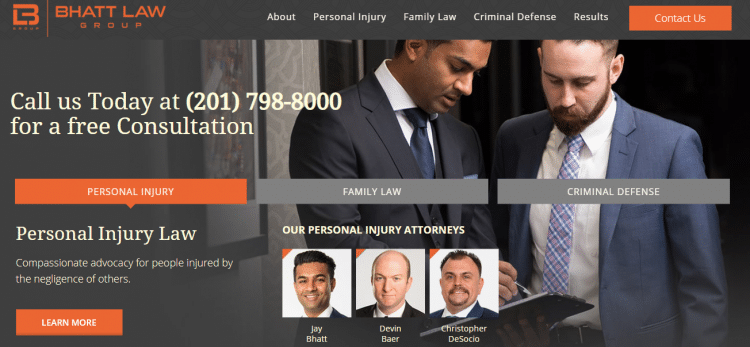
If we have to categorize the best law firm websites based on design only, then, without a doubt, Bhatt Law Group will be among those topping the list. The law firm's emphasis on branding is on another level. The orange and black colors look perfect on the site.
A close look at the site shows that they've incorporated contact details and various legal specialties. It's amazing how they've done that without including so much irrelevant data. Clicking each category lets you know vital details, including attorneys that will help you.
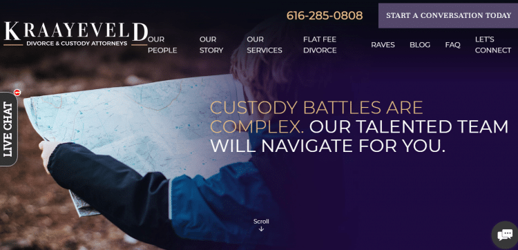
Law firms specializing in family law know how hectic it can be when getting known, especially when starting. Kraayeveld Law Offices has a trick for you. The firm takes divorce matters with the seriousness it deserves.
The tagline in caps' DIVORCE CAN BE DAUNTING' shows that the firm appreciates how hard divorce can get. That's evident with a characteristic color that also matches the call to action. Clients are prompted to start a conversation to solve the issues. There is also a blog to keep clients abreast of legal knowledge and happenings.
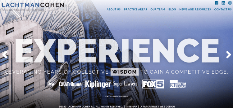
Lachtman Cohen law firm knows how to get the prospects glued to the site. Let's first appreciate the creative super gorgeous piece of art in the background. The structure is good looking and fits perfectly. Visually, the website scores pretty well.
When it comes to highlighting what the law firm does, everything is in check. Unlike some websites that flood tones of information confusing the prospects, the site knows how to maintain simplicity while explaining multiple practice areas. Thanks to its website layout.
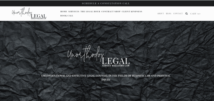
The Unorthodox Legal is a law firm website serving creatives across various sectors. The website embraces minimalism in design and color combination, yet it lets the artists know how they can benefit when they contact the owner, Ashley Williams.
Nothing is left unattended. Clients can easily acquire the desired agreements from the contract shop at ease. Ashley Williams also knows how to get the creatives into the firm, and through creative posts on Instagram, the firm gets to convert prospects into actual clients.
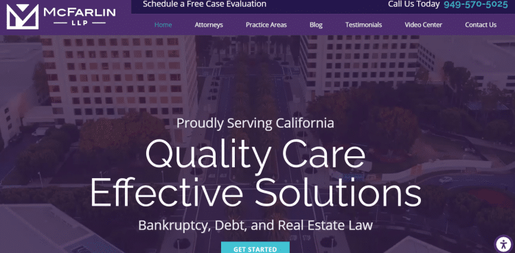
Browsing the McFarlin LLP site tells you that you're not out of place. Its background visuals indicate that businesses and individuals can benefit from their bankruptcy services. With a tagline that assures business protection and delivering individuals from personal debt or any other disturbing scenario, prospects get assured of a solution.
The color combination also restores the prospect's hope without letting them feel desperate about their situation. McFarlin LLP focus on content marketing is excellent, with so much to learn.

The introductory video welcomes you to the Dilworth IP's site. The technological aspect of the video makes a clear statement about the law firm's focus on technology. You don't need to spend much time to know what the law firm does.
The law firm vision, promise, and practice sections answer all the prospect questions easily. A recent news banner also updates the readers on several relevant occurrences and general knowledge in the legal space.
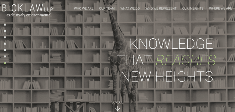
Bick Law LLP knows the power of specialization and keeps everything focused on what they do. Their main practice is on environmental law, and the background image of the giraffe coupled with the logo tagline that reads 'exclusively environmental' tells it all.
Dictating the law firm specialization and emphasizing the main practice area works pretty well, especially if you want to attract the right audience. The height of the interlocking shelves and a giraffe evidences their knowledge on matters of environmental law.
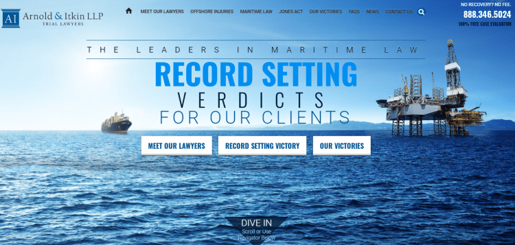
Arnold & Itkin LLP Trial Lawyers know how to capture the attention of the prospect. But they don't just do it the obvious way. They know what you want, and they're ready to achieve victory in your maritime injury case.
Their bold assertion that reads 'WE'VE WON BILLIONS OF DOLLARS FOR OUR CLIENTS' instills confidence in their services. More so, you have a chance to have a look at their previous victories.
The blue ocean waters on the background and the same colors on the law firm website bring about a perfect color theme. The site optimization, performance, and content make it quite effective.
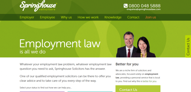
The best law firm websites want the client to know most things about their firm, even without calling for inquiries. Springhouse Law has dedicated its websites to marketing its services and answering the frequently asked questions.
For instance, a well-detailed page answers how the law firm works and charges its services. With many clients worrying much about the cost even before the process commences, a little knowledge comes in handy.
Owning the best law firm website is no longer a luxury. Your website is an online asset. When built with proper elements, you get to convert visitors into leads with ease.
A substantial number of clients seek legal services online each day. That’s where they visit first, and the trends seem to continue every day. That means if your website can stand out from the rest, you’ll enjoy organic traffic, making it easy to win potential clients.
Here are some of the reasons why the best law firm websites serve the prospects and the particular law firms to their advantage:
For a law firm website to appear great in both text and images, there is so much focus needed on design and creation. Here are key tips to help you:
 Observe Simplicity
Nobody is willing to spend the whole day on your site. Prospects want a website with simple and straightforward briefs, especially when in distress. Don’t clutter or complicate things on your law firm website. It scares clients.
We earlier indicated that beautiful pictures stand out. Well, don’t cling so much on any pretty picture. We recommend that you use beautifully captured professional pictures that pass a message across. Pictures will influence your firm’s position and user experience.
Branding is not all about your law firm logo. It extends further, and you have to invest in your time and resources. Your website's general layout and content tell your prospects the type of law firm you are and how your brand stands out.
You need to put up appropriate content relevant to your practice. The same applies to images and other visual elements. Have a brand that people will want to be associated with without fear of compromise.
Having a mobile and desktop responsive website is not an option. Almost half of your visitors will find you via smartphones and tablets. Ensure your website is well-optimized for mobile phones to attract many prospects and possibly convert a few.
Many law firms think that the “About Us” page is enough to showcase the contact details. But that is not the case. Best law websites will incorporate phone numbers, Messenger or WhatsApp links, and email.
Best law firm websites keep updating their blogs, success stories, news, and other resource pages. As the internet advances pretty fast, people are always searching for up-to-date legal content and articles.
One way to extend your law firm’s reach is to link your website to various social media accounts with billions of social media users. Integrating Twitter, LinkedIn, and Facebook will continuously increase your legal clients.
Doing all the above is awesome and guarantees results. But one more thing: stimulate the effects with a captivating call to action. Modify your call to action in a way that you get what you want from clients. Importantly, encourage prospects to take action.
Still, on designing, there are law firm features and design principles, that when included, you differentiate your law firm website from other sites out there. They include:
From personal injury to criminal law; Real estate to family law, you need to let your prospects know your legal expertise and areas of practice. Doing so notifies the client that you’re the right fit for the task.
Some law firms ignore this section, but it’s quite important. Dedicate a space or an entire page to recognize your legal team. Ensure you’re clear on their contact details and areas of practice. That makes it easy for prospects to know who suits them.
What is your list of pages that will form your website? That’s your sitemap. A clear sitemap tells you the information required before your site is live. Have pages that are easy to optimize for faster ranking on the SERPs.

Won an award or a top publication mentioned your firm’s name? Have a section on your page to let prospects know about it. That’s the best way to maximize trust and credibility. Clients want to deal with experts with a proven work record.
So, there you have it. The above 50+ best law firm websites are a game-changer in the legal space, and you learn a lot from them.
Having the best law firm website requires you to invest in the right development and design skills. While sparing time from busy schedules and learning might take you longer to perfect the art, we have some good news for you; our experts will help you design and create a website that converts.
Ready to boost your online arsenal with the best law firm website today? Let’s hear from you!
