


Let's be honest! Whether a solo office or group entity, every chiropractic practice does everything they can to offer exceptional services to win the heart of patients and stand out as the most preferred go-to choice. But there is more to that. Like any other business, chiropractors must position and market their practice to enjoy maximum benefits; that's where a chiropractic website comes in.
Best chiropractic websites leverage excellent and creative ideas that focus on design, content, performance, and other website features. With that, there is a guarantee of a website with a superb outlook and a professional touch. Such websites attract new chiropractic patients and retain existing ones.
If you're looking forward to owning one of the best chiropractic websites, look no further. In this article, we'll dig deeper into the 30+ best chiropractic websites for 2021 as we let you know why they're outstanding and worth emulating in the modern chiropractic marketplace.
But before that, here's why chiropractic website marketing deserves prioritization.
Among the best chiropractic marketing advice you'll come across in your online marketing journey is the need to invest in chiropractic website marketing. With 95% of chiropractic users showing the satisfaction on services they receive from various chiropractors, and the number growing steadily over the years, a perfect website is necessary to win potential patients.
If you're hearing this for the very first time, a chiropractic website tells potential and existing patients about you and your practice; it's your salesperson. It's here where website visitors get to know about your services, the location, the content you publish, your team, what people have to say about you, and much more.
While the website addresses various things and showcases your business online, a slight mistake in content and design will cost you dearly. For instance, a busy site does not communicate effectively. The same applies to sites that leave crucial details. An excellent chiropractic website design is critical!
 With a well-designed, updated, SEO optimized, and informative website, you will quickly realize your chiropractic marketing goals. Here's what we're talking about:
Remember, every effort to market your business online, including chiropractic clinics, links back to your website. If you're among the 36% of small businesses that lack a website, you're giving your competitor a chance to outsmart you. Around 80% of people will do an online search before contacting a business, and you don't have to miss the opportunity to be seen.
Whether you're redesigning your existing website to suit the current trends or creating a new website from scratch, having a look at the below 30+ best chiropractic websites will give you the ideas you need to have onboard.
Without a doubt, you'll find so much inspiration from this comprehensive list.
Let's get started!
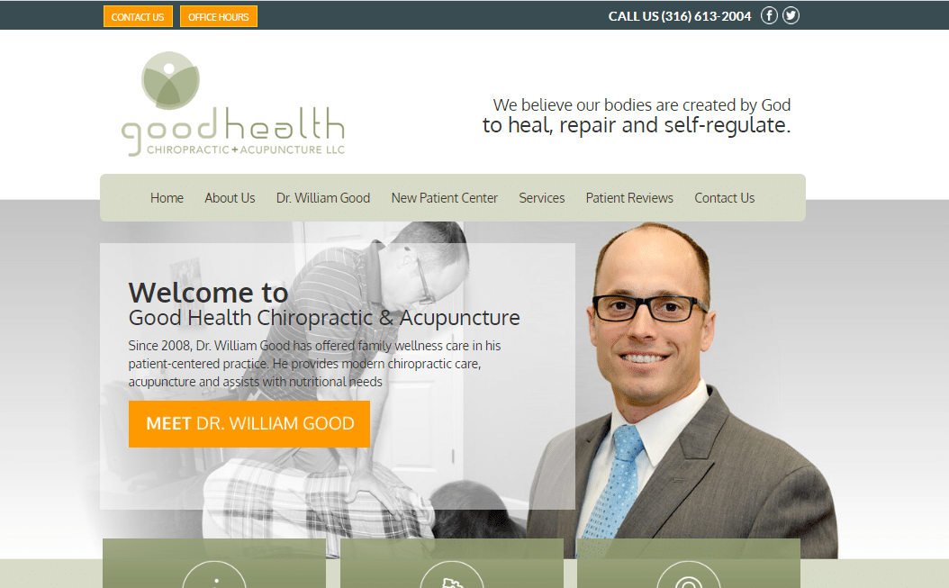
Good Health tops our list. Everything seems rather simple and straightforward on this website. Readers will have a chance to meet Dr. William Good and learn how he can help with their chiropractic needs. Thanks to the welcoming message, smiley background image, clear fonts, and a comprehensive menu. A simple scroll down reveals what you will experience from the services, testimonies from former clients on a slideshow, and an access map. Potential patients can also learn about their office hours to avoid instances of missed appointments.

Fidelity Health Care chiropractic website draws new visitors pretty fast. The quality and attractive background images, coupled with the perfect color combination, have come out perfectly. Strategic contact details and office location information make it easier for interested patients to contact Dr. Taylor. The page on doctors’ experience provides a potential client with an overview of the level of care to expect. On the homepage header is a digital form for an appointment request and office hours’ schedule. That helps generate more leads.

The simple yet detailed text and video information captured on this website influences a wider audience to take action. Perfectly listing the services provided and the conditions treated on the site creates awareness, and patients get to know what to enjoy once they make a booking. The site facilitates online booking for new patients and has a Google map to direct visitors to the clinic's physical location.

Best chiropractic websites need to be great and informative to help relay their services to the right audience. It’s because potential patients tend to extensively analyze the site to know whether it addresses their deeper health concerns. An essential aspect of this website is the clarification of their specializations on the first page. Again, the background is inviting. Atlant Health also understands the need for a professionally organized and easy to navigate website to improve customer engagement.
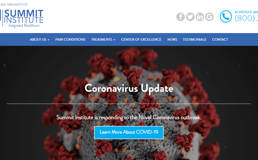
The website captures the viewers’ attention, awakens their emotions, and gives them a reason to contact back. That depicts a chiropractic feel. The explainer videos help patients make informed decisions towards improving their quality of life. It’s also evident that the homepage demonstrates responsiveness and commitment to the overall wellbeing of their patients. Thanks to the news page, it keeps visitors educated on various aspects of chiropractic care. The testimonials affirm the clinic’s reputation, expertise, and extensive experience.
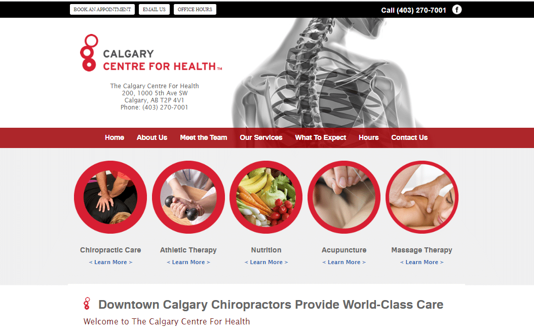
Many website visitors tend to ignore busy sites. From this website, you can notice that there are other engagements like massage and nutrition. That assures comprehensive treatment. The site is very readable and offers a great experience to visitors. The images, color scheme combination, and conspicuous contact details easily drive readers to action. As you scroll the site, the smiling faces are a cue to approachability, assuring patients of the commitment to nurturing a personal connection with their doctors.

A quick way to communicate your chiropractic brand and the solutions you offer is through a website. Midtown Chiropractic makes known its new approach to healthcare through its site, and that leaves patients wanting to know more. Another interesting part of this site is the relevance and readability level of their homepage. It broadly enlightens the viewer, prompting them to check through other pages. The review page and testimonials confirm their trustworthiness.

As we've said earlier, a website is your business's front door. Elevate Chiropractic is designed with an audience impression in mind. It has family photos that convey the exact intent of its practice "to elevate your life." At a glance, you can tell they aim at improving the quality of life among families. Everything is functional, allowing visitors to learn more about their areas of interest easily. One more thing: their offer notice is appealing to ensure more patients make a booking.
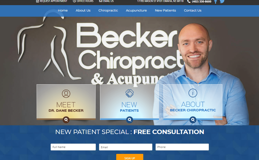
A perfect color theme makes this website more engaging to prospective patients. Dr. Becker jovial background photos, other media, and color combinations stand out. They signify love and trustworthiness while capturing visitors' attention easily. The blue shade inspires confidence among potential clients and gives them the impression that they are welcome at Becker Chiropractic. Clients can easily inquire and enjoy free consultations.
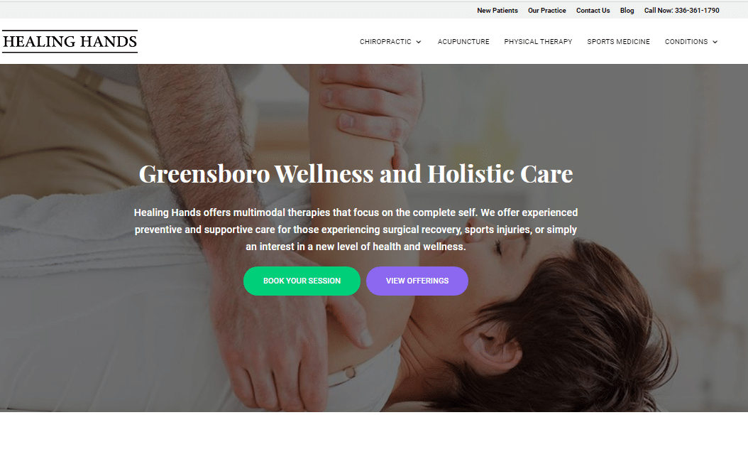
Healing Hand Chiropractic website is attractive, fun, and exciting. The title “healing hands” describes the technique used in chiropractic care to restore health, and that gives patients hope. The site uses a card-based design with highly responsive links below each image detailing the various services offered. The move allows clients to interact more with the site, which improves the conversion rate.

Every chiropractic practice website needs to boost its virtual capabilities and give customers what they want. Remember, content and visuals will impact the conversion rate, SEO ranking, and visitor engagement rate. Parkview knows all this; its colors, font, and embedded images offer an improved user experience. Aesthetics keep visitors glued to the site longer. That increases the chances of patients calling to action.

Design and functionality complement each other when it comes to creating the best chiropractic websites. The design captures user attention, while functionality enhances the interaction on the site. This website uses modern graphic technologies to offer great visual cues to viewers. Once you’re on the site, you’ll realize a detailed menu and live chat to improve customer experience by providing 24/7 support services.
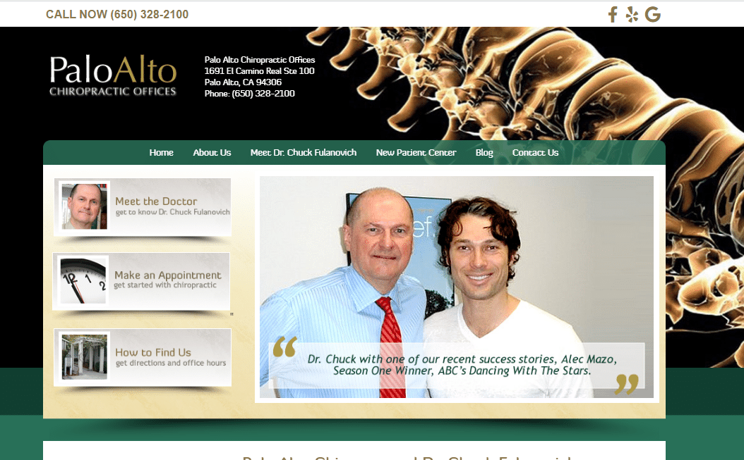
By checking through this site homepage, patients can get all the key details they need. The website is clear on who attends to patients, the specialization, how to make appointments, and where to find the chiropractic offices. There’s a blog page to keep viewers informed on various chiropractic topics. With a clear call to action, visitors can book an appointment, make a call, or send an email.
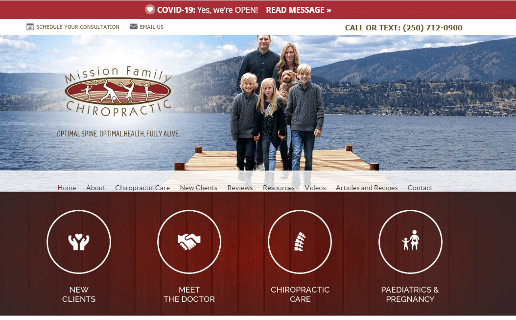
Here is one of the breathtaking chiropractic websites that embrace optimal health. The grand color scheme helps draw patients' attention with a calming effect despite their current situation. The website is uncluttered, well balanced, and simple to scan through, ensuring that readers get the information they need with ease. Visitors can also check the reviews, resources, and videos to establish chiropractic practice worthiness.

Dr. Berner's compassion for quality family chiropractic practice is evident in this website. The simple layout makes the top-notch website easy to use, even for new patients. Coupled with reviews, testimonials, contact details, and a Google map, prospects can quickly reach out. More so, there is a boost to their credibility and mobile traffic, which helps convert prospects to new patients.
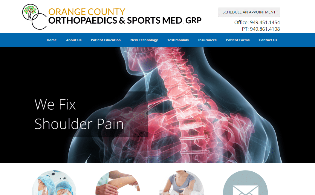
The chiropractic site welcomes you with a perfect topology of its name. There are slideshow images in the background related to their services and a picture of their location. It also has images of orthopedic surgery, physical therapy, patient education, and ways you can contact them. A brief description of Dr.Greenbaum provides a reliable overlook of the kind of services you will be getting and the doctor treating you.

The website has much to offer. Learning about Dr. Dean Goodman makes it an exciting read, especially with the emphasis made on his achievement. Additionally, its detailed description of the services backed with quality pictures makes it easier for any reader to understand what they expect. The location, link to Facebook give patients a chance to learn more about their services. More so, patients can book an appointment by providing the name, phone number, email and briefly describe their problem.
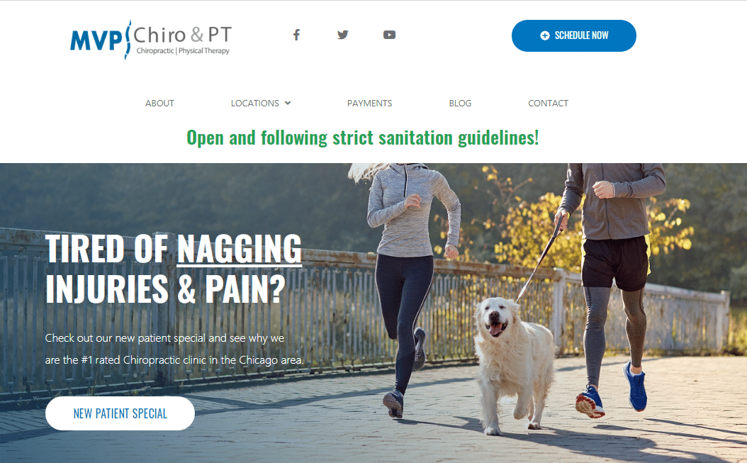
If you are looking for an inspiring chiropractic practice website that’s helpful and straightforward, this website should be your pick. Its website design is easy and excellent. The media, locations, and focus on injury and pain give confidence and trust in the homepage services. It’s the patients’ first impression. Further down the easy to navigate website, patients learn about former patients’ experiences, the services they get, and how to book their services with ease.

The Chiroff Health & Wellness website knows how to use powerful statements that convert. The statement “A HEALTHY LIFESTYLE IS WITHIN REACH” and a smiley family in the background captures the patients’ attention and assures treatment that heals their body. When it comes to the website design, its simplicity carries the day, despite having adequate information about the doctor, benefits of chiropractic care, ways to choose a chiropractor, and links to social media accounts.
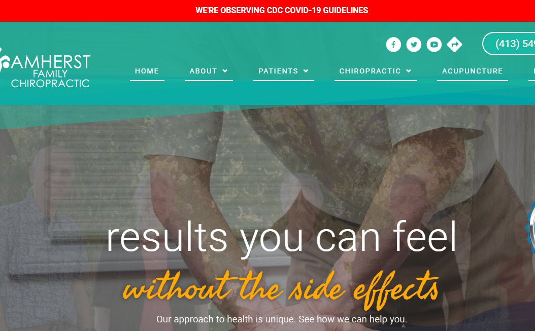
This website adopts a simple design that puts everything to light in the most natural way. Having relevant pictures provides a sense of personal touch to the type of services you are about to get. They explain your healthcare goals and information about their services, making it easier to navigate and learn about their services. Patients get assured of a unique treatment approach without side effects.
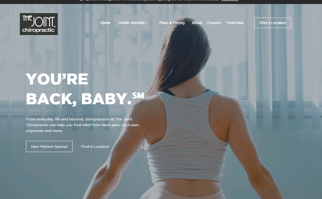
A well-balanced mix of images and choice of words is what explains this website. Potential patients get to know how much to pay, the service mission and commitment, and access recent health articles and videos. Chiropractors looking forward to building their websites can learn a lot from this website professionalism, especially the use of attractive colors, excellent taglines, CTAs, and ease of finding their offices.
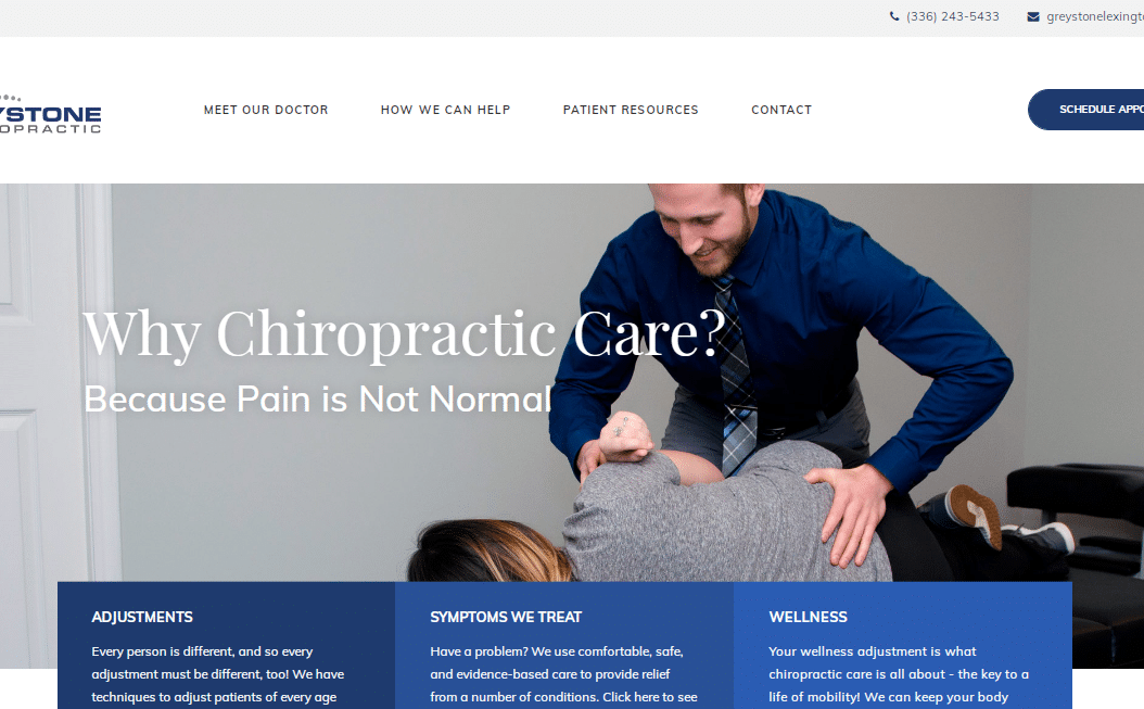
Everything to do with this website is summed up with the first impression. The blue color that blends very well with white spaces sends a very clear message; patients can calmly have the opportunity to know the kind of adjustments, symptoms treated, and the need to choose their services, without tension or making a lot of navigation on the website. Videos, testimonials, and CTAs also come out very well.

Chiropractors need to be clear on their expertise, and intention from the word go. On this website, you'll start by noticing the hand-made love sign that depicts this website logo and a pregnant woman's picture, which brings out the whole family chiropractic practice services' uniqueness. Dr. Christina Kulesz provides a clear description of the services available and the present special offer. The comprehensive hero header is informative to ensure patients take action.

In order to stand out in the modern chiropractic world, you need to observe minimalism and elegance in your practice website. In this website, all that is clear; from the website layout to quality group image. You notice more of this once you navigate further down the website. Gateway Family Chiropractic also embraces the strategic positioning of its contact details. The branding words “Soft touch technique” have a special color and font to get maximum attention. Such features win patients by a lot.
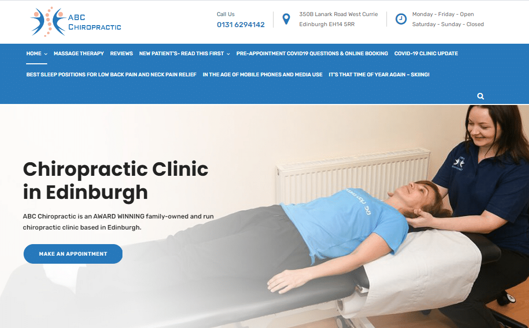
On this website, chiropractors can borrow a leaf or two. It’s because the website leverages the power of maximizing the call to action, using minimal images, and having the right color combination. These are the features that make the ABC Chiropractic website lively. Again, due to its simplicity, potential patients can learn a lot with a simple click of the button. Whether it’s when to seek their services or make an online booking, the homepage details everything for patients.

By the look of this chiropractic website, we can all agree that the design chosen is seamless. The delightful image, matching theme, and eye-catching fonts give the website a sleek modern look. We can’t forget to mention that the website explains all the options that patients have and helps them make better choices without overwhelming them with family chiropractic content. Such a website is worth enumerating.
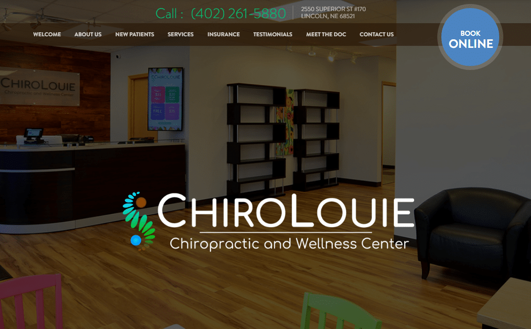
Chiropractic patients love it when they browse a website and identify everything they want without wasting time. Chirolouie has a modern and stylish website design that will get patients’ attention very fast. The logo is welcoming and attractive. More so, the phone number has large digits for easy visibility. New patients who have come across this website and browsed the special packages and services offered by Dr. Louie Yang won’t hesitate to make an online booking.
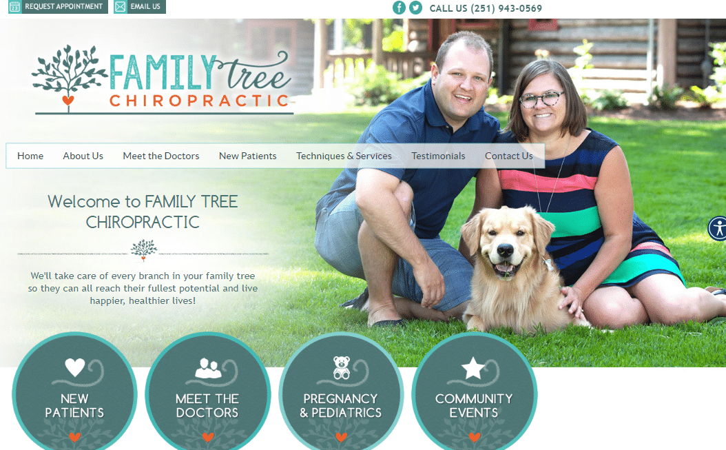
How your chiropractic website appears online says a lot about your brand. Foley Chiropractic website showcases a simple web design that focuses heavily on letting people know its brand presence and worthiness. The logo and its components create a picture in patients' minds, giving them hope for excellent family chiropractic services. The same applies to the centrally positioned main menu bar. When building a website, the choice of design and style determines the overall benefits that come across.

Here’s Dr. Finn chiropractic website looking beautiful with reddish-brown, orange, and black fonts. You’ve probably realized that the doctor’s center name rhymes with the domain name, and it comes out pretty cool. The website is another example of the best chiropractic websites that have effectively embraced branding. Once the patients get attracted by the ever jovial background image, the next step will likely be getting to know much about Dr. Finn. That keeps them more on your website, and converting them becomes easy.

This website is one of the best examples to pick for those who love putting their chiropractic practice experience out there. It clearly states that they have been in the practice of “Whole Health Integration” since 1992. That alone wins patients interested in a well-experienced chiropractor. The color scheme and simple design guarantee easy maneuverability and readability. Well, this site might have used only a simple residence image, but it still meets the standard of most elite websites.
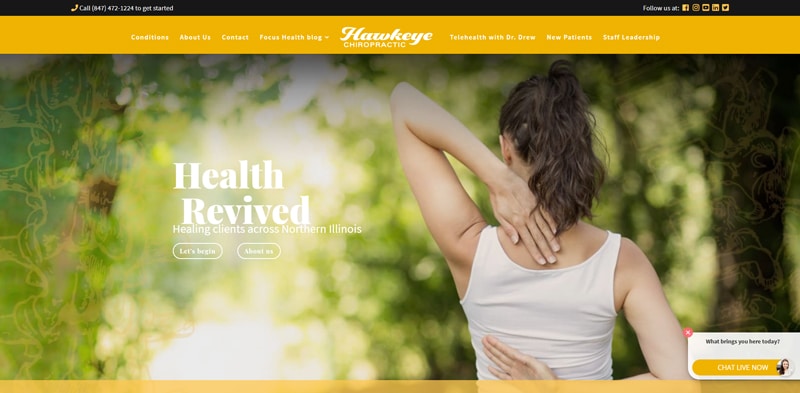
Hawkeye Chiropractic's website demonstrates their mission digitally by their focus on making sure you first understand how they can help you, next how they do it (without use of drugs, shots or surgeries) and then what the process is to take the next step.
We also like the streamlined design and easy navigation which make this a great website to follow and model after.
There you have it.
The 30+ best chiropractic websites that when looked at keenly and the best traits implemented, you get to stand out in the competitive chiropractic field and win new patients. The secret to building the best chiropractic website that deserves mention is simple. Keep up with the current trends to ensure you own a website with perfect design, quality content, and maximum performance. But again, that might call for a professional if you lack the skills.
Need any help in chiropractic website marketing? At Ignite Marketing, we’re here to help you. We pride ourselves in executing marketing that ignites growth and revenue for chiropractors. Book your session today!
