
Did you know the average conversion rate on a Facebook Ad in the healthcare industry is around 11%? That’s 1.79% higher than the average across all industries.
But who likes being average?
You want an unbeatable Facebook Ad campaign that blows away the competition and gets new patients into your practice. But is it possible to beat the odds?
Absolutely!
The conversion rates on eight of our most recent Facebook Ad campaigns for chiropractic offices were 46.43%, 40%, 38.46%, 41.67%, 41.89%, 73.29%, 53.39%, and 50% respectively.
So what makes a good Facebook Ad? How do you achieve higher conversion rates?
TL;DR ANSWER: It depends on a number of factors including ad copy, images, audience intent, and messaging consistency. Ultimately, the most important factor is that you’re testing your chiropractic Facebook campaigns.
Let’s take a closer look at the anatomy of great Facebook ads so that you can craft your own.
We’re not going to lie.
The healthcare industry is one of the hardest-to-navigate verticals when it comes to Facebook Ads. That’s only because Facebook’s advertising policies are somewhat strict about healthcare claims and personal attributes. Compliancy is essential if you don’t want to get your ad account suspended or permanently terminated, so make sure you know what you can and can’t say by reading up on the rules.
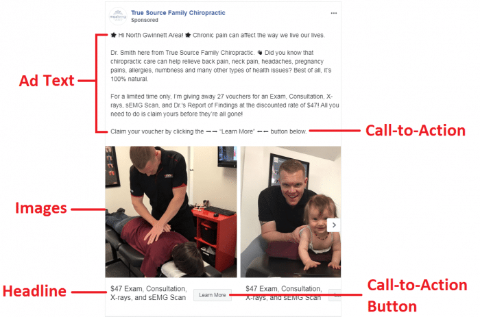
With that in mind, there are three main copy components you need to consider when crafting high-converting and complaint ads: 1) the headline, 2) the copy body, and 3) the call to action.
Here’s what that looks like on a Facebook carousel ad:
Before you tap out a single word, though, you should:
Besides being punchy, good ad copy is buyer-focused and solves a pressing pain point.
So let’s briefly explore this within the context of the three ad copy components
Captivating headline copy instantly hooks an audience and increases conversion rates. This short, snappy line forces you to get to the point of the ad, helping you attract attention while appealing to your ideal prospect’s needs and wants.
The good news is that there are a plethora of Facebook Ad headline formulas you can dig up by doing a Google search.
You’ll find the best headlines:
What about the ad text?
Each ad format allows you to create a certain amount of ad text that further explains your offer and entices your audience. No matter what kind of ad type you choose, the copy should ramp up desire and inspire action.
Good ad text leads with a solid hook, reflects the buyer’s struggle by agitating pain points, describes the solution in the form of what you’re offering, highlights the benefits and value, tells the reader what to do next, and supports the visual (i.e. the image or video thumbnail). It’s relatable, it’s specific, it’s relevant, it’s timely, it uses language the audience uses, it’s emotion-driven, and it’s written with the brand’s voice in mind.
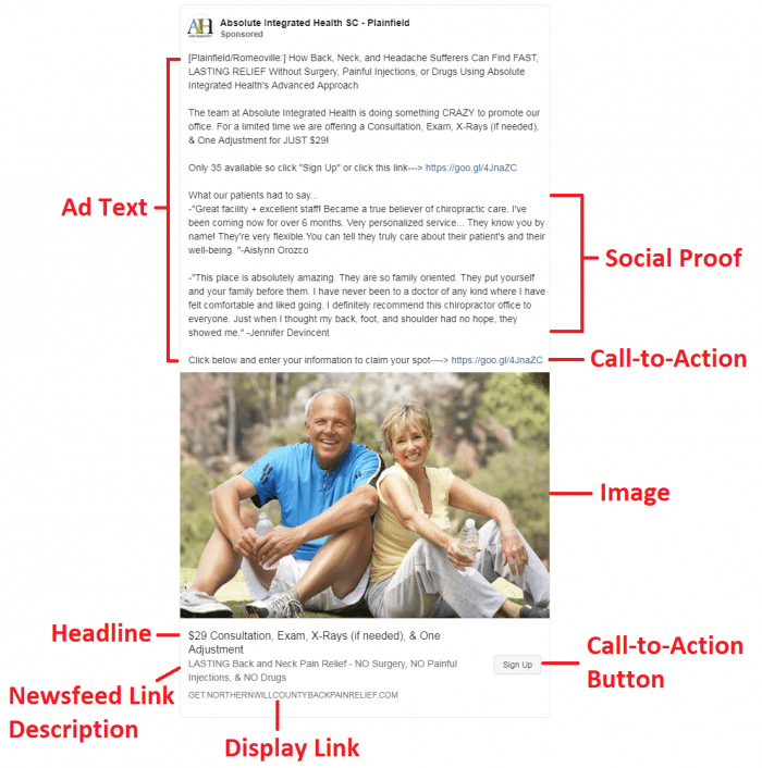
In many cases, it also includes social proof, such as the testimonials in the following ad example:
Even if you’re running a video ad, the script needs to contain these elements and the ad text needs to support it.
As you can see in the ad example above, there are two ways to incorporate a call-to-action (CTA) in your ad. The first is by writing CTA copy into your ad text and the second is by selecting an appropriate CTA button when setting up your ad in Facebook’s Ad Manager.
There’s an advantage to both. While the former lets you build a story around the CTA and expand on why people should click the button (or link if you’re adding the URL to the ad text), the latter actually looks like a button—and who doesn’t like clicking those?
So, what constitutes a good CTA?
If you’re looking for additional help, we’ve written an entire post on creating Facebook Ad funnels with an in-depth section on crafting CTAs for both your ads and your landing pages. Be sure to add it to your reading list.
Now let’s look at the visual aspect of a good chiropractic Facebook Ad.
Believe it or not, images matter more than copy. An eye-catching visual stops scrolling in its tracks and entices a user to read the copy.
Great images or video thumbnails take three things into consideration:
Besides being a high-quality image, the visual must match the message in the ad, incite the right emotion, and capture attention. Good images often include a pop of color that contrasts well with everything else going on in a user’s Newsfeed. Keep in mind, the design must capture your target’s eye.
As a chiropractor, you’ll want to use images that reflect what you do, who you are, and the outcomes you offer patients through your treatments. The carousel and single image ads above are great examples.
At Ignite Marketing, we like to take up as much Newsfeed real estate as possible by combing images to provide a fuller picture. Here’s an example:
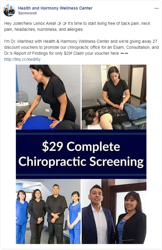
Different ad types call for different ad sizes. Good ads are correctly sized and clear.
Since mobile use had dramatically increased over the years, it’s crucial that a visual works just as well in a mobile Newsfeed as it does with other ad placements. Again, the image should be in a high-quality resolution, clear, and easy to see.
As a final note, be sure to test your image with Facebook’s text overlay tool when adding text to an ad image. Too much text will reduce your ad’s reach and hinder its performance.
Ads are more effective and affordable when you use refined, strategic targeting, and no other advertising platform beats Facebook when it comes to targeting the granular characteristics of your audience.
Some of these options include targeting user profiles based on:
Facebook lets you easily dive into the nitty-gritty of your ideal buyer persona while focusing your brand message and marketing dollars on a market that is highly likely to buy from you.
But when writing your ad copy and developing other assets in your funnel, you also have to consider user intent.
When your target buyer clicks on your ad, they expect to be directed to a page where they can complete the action you’re asking them to take.
Whether that’s…
…you need to ensure there’s messaging consistency between the Facebook Ad and the landing page.
In fact, Facebook won’t approve your ad if the URL is not relevant to the ad copy.
Check out the following example from Optimal Health Sports & Family Chiropractic. Here’s their Facebook Ad for a deeply discounted body contouring package:
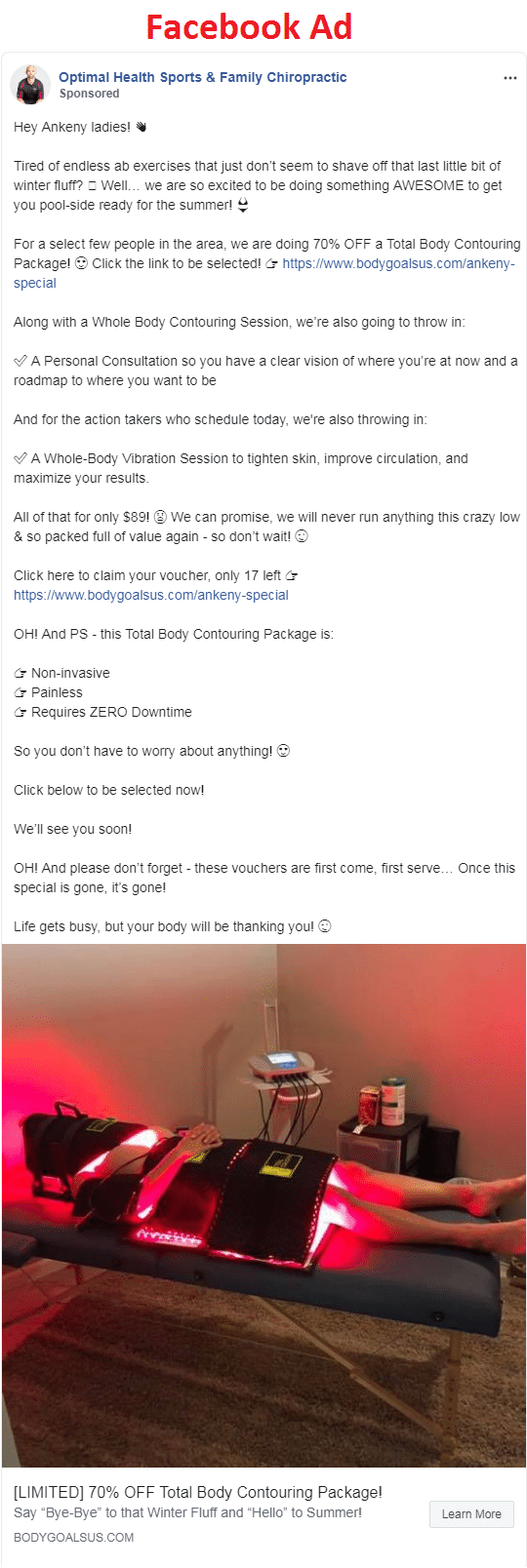
Here’s the matching message and imagery on their landing page:
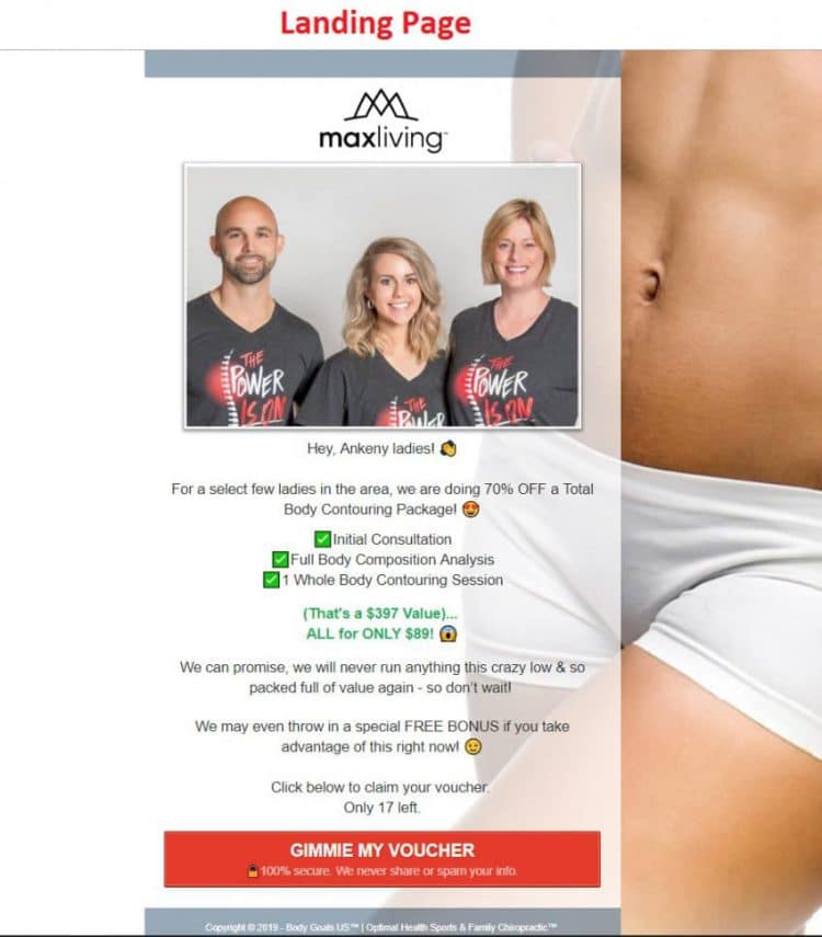
Anyone clicking on the CTA in the Facebook Ad expects to see similar copy on the landing page and be able to claim the offer. With Facebook Ads, messaging consistency and relevancy results in better ad reach and performance.
This brings us to the next factor in creating a great chiropractic Facebook Ad…
 Even if you think your ad is great, your opinion doesn’t mean anything. The only way to truly optimize your chiropractic Facebook campaign’s performance is to split test various elements of your ad.
What should you test?
Your offer: Strong copy will never overcome a poor offer, so make sure you develop a handful of compelling concepts you can test. You might find that different chiropractic offers convert better at different times of the year or that certain audience segments respond positively to specific types of offers. What can you do to sweeten the deal?
Your copy: From the value proposition, headline, ad text, and call to action to the benefits, features, emotional angle, and length (short-form vs. long-form) of your ad copy, every aspect needs to be tested.
Your ad’s design: Since visuals are so important in capturing attention, try a range of images or video thumbnails to see what stands out in your audiences Newsfeed. In addition, consider how the use of emojis in your ad text and headline can change the look and feel of the ad. In one case study, adding an emoji to the ad headline resulted in a 241% higher click-through rate.
Other variables: Besides the ad creative, consider how you might change your targeting, ad placement, campaign objective, ad type, and landing page.
To get the most accurate results, be sure to only change and test one element at a time. You essentially want to fine-tune your campaign until you have a super ad that’s optimized for conversions.
Creating a good chiropractic Facebook ad that’s both compliant and conversion-optimized isn’t easy. However, if you create the right offer, stick to tried-and-true copywriting formulas, choose attention-grabbing visuals, and target the right audience, you’ll have a great foundation for an ad that delivers results. Don’t be scared to play around with your creative and test. You never know when a minor tweak will take your campaign from being average to being unbeatable.
*Disclaimer: Not all of the ads in this post were created by Ignite Marketing. Don’t swipe the ad copy, but rather use it as inspiration for your own creative.
Have a question about Facebook Ads or need help running a campaign? Drop us a line in the comment section below or book a free 15-minute consultation.
