

The Entire Series:
If you’ve been following our series on inbound marketing for small and local businesses, you might have noticed it’s time to gear up for phase #2 of the process—the phase where your previous efforts start paying off in the form of valuable, qualified leads.
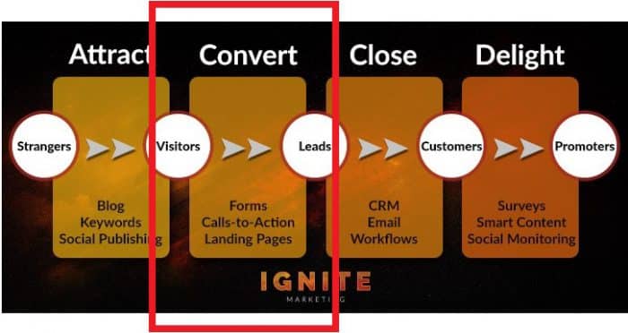 Before we jump into the exciting topic of visitor to lead conversions, let’s quickly recap what we’ve covered so far:
But now that you’ve driven visitors to your website with these attraction strategies, you need a way to move them into the next part of your funnel by converting them into leads. A lead is someone who has indicated their interest in your business’s products or services by giving you their contact details and some basic information in exchange for an ‘ethical bribe’ (a.k.a. lead magnet) such as a free guide, consultation, or similar offer. This is where calls to action, landing pages, and forms play their role.
Here’s a visualization of the transition from visitor to lead:
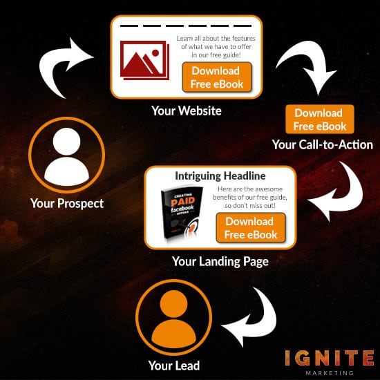 In the following sections, we’ll evaluate each of the three core components, providing examples, best practices, and tips for optimal conversion rates.
 No matter what your goal is, the copy around your offer has been crafted for the sole purpose of inspiring action. People who don’t click don’t convert, making your call to action (CTA) an essential part of your web page—the doorway to conversions, if you will.
How do you create a CTA people want to click?
Let’s start at the beginning.
What is a Call to Action?
A CTA is an attention-grabbing, clickable button (sometimes a link) with a snippet of concise copy that prompts a user to take a specific action. It’s typically written as a command, such as ‘Sign Up,’ ‘Download,’ ’Contact Us,’ ’Book Now,’ or ‘Buy Now.’
 Every page on your site should have at least one clear CTA, which is referred to as your primary call to action. This is the single most important thing you want people to do on that particular page. However, it’s also common for certain webpages to have secondary CTAs.
Secondary CTAs are alternative actions visitors can take if they’re not yet ready to commit to your primary offer. They’re less prominent on the page and can take the form of anything from social sharing and blog subscription buttons to ‘learn more’ and newsletter signup buttons. These CTAs are your contingency plan—a way to keep people engaged with you until they’re ready to convert on your high-commitment offer.
Keep in mind that every visitor to your site is at a different stage of the buying cycle. Some people will require additional information or further engagement before they trust you enough to hand over their personal information. Secondary CTAs can help you minimize lost conversion opportunities by appealing to all levels of the buying cycle, giving people an opportunity to convert on smaller actions as they progress to the next stage of the sales funnel. These CTAs also allow you to add diversity to your promotions, giving people the option to convert on something that might interest them more than anything else you might be offering.
Consider the example above from Northeast Portland Chiropractic Center. Just beneath their homepage header with their bright blue primary CTA button, they prompt you to check out their individual services with a series of ‘Learn More’ buttons—their secondary CTAs.
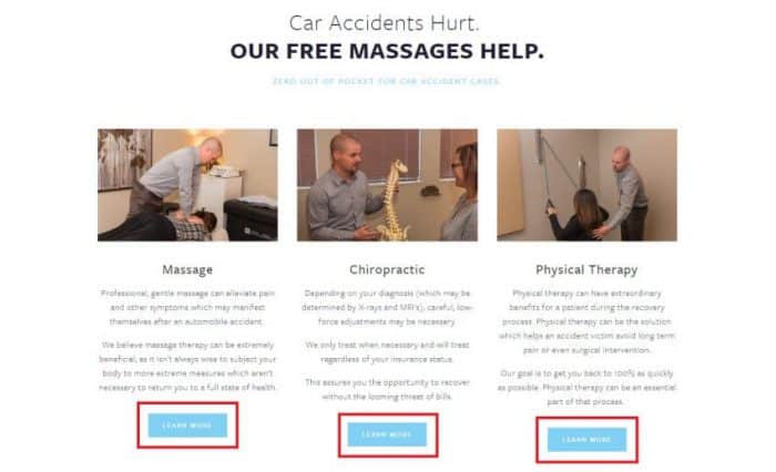 Each service page provides additional information about the therapy offered and then gives visitors another opportunity to convert by scheduling an appointment. These secondary CTAs don’t compete with the main goal but rather support it.
Now did you catch the less noticeable ‘Schedule’ button in the top right corner of the homepage header? I’m not trying to fool you by ignoring it. This CTA button is linked to the primary offer of a free exam as advertised in the copy on the main blue button. Click either and you’ll find yourself presented with the same scheduling form. The differences in the buttons lie in their color, copy, and style.
What about different kinds of CTAs?
 HubSpot identifies 8 types of CTAs you need to have on your website and 8 types of CTAs you should absolutely try on your blog. Since we’re in the ‘Convert’ stage of the inbound process, we’ll specifically deal with lead generating CTAs in this post. It’s well worth adding HubSpot’s posts to your reading list for complete optimization of your website. We will also continue to cover CTAs as part of our in-depth series on inbound marketing for local businesses so that you gain a good understanding of where and how you should be using the other types of CTAs.
So, what are lead generation CTAs?
These are calls to action that sit at the top of your marketing funnel. They specifically ask your audience to take action on a lead magnet that’ll net you at the very least an email address you can later use to nurture prospects into a sale. The key to success at this point is to get your visitor onto your email list.
Consider this in contrast to the benefit of a social sharing CTA. While visitors sharing your site and content will broaden your reach and help with factors like social proof and SEO, you won’t have further contact with those people unless they return to your site. Getting them onto your email list allows you to start a two-way conversation.
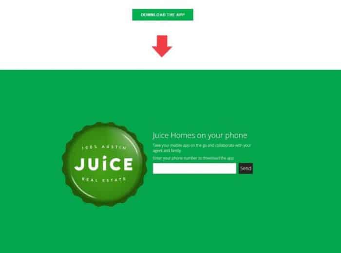
Now a CTA button or link can do a number of things. It can send your visitor to a different webpage or dedicated landing page. Here’s an example from Austin-based Juice Real Estate Co. where a simple button at the top of their homepage redirected people to a dedicated landing page for their app offer
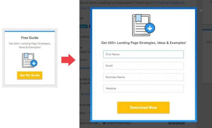
 It can trigger a popup form like this one from Wishpond.
 It can also be embedded at the bottom of a lead form on your site, allowing visitors to complete the signup directly on your page. Here’s an example from City Gym in Kansas City:
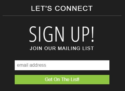 How you set up your CTA will depend on your goal, the offer’s placement, your website’s platform, and your email marketing system.
But there’s another choice to consider when it comes to CTA buttons: will you create a single-line button or a multi-line button? The former is simply one short line of text with a command (as in the examples above), while the latter can put your CTA on steroids by adding value, eradicating objections, or even reducing anxiety. Here’s an example from The Renegade Diet sales page:
 You’ve probably seen many examples like this where messages similar to “No credit card required,” “Save 50%,” and “Cancel anytime” are either on the button or in close proximity to it. We’ll cover best practices for writing compelling CTAs of your own in a minute, but your decision here depends on the action you want people to take and what objections they might have. A more complex offer might require more finessing of the logical and emotional pieces of your text while a simple offer with less risk is more straightforward.
CTAs vary in size and style. However, buttons that convert well have certain characteristics against which you can benchmark your own.
What traits do they have?
They look like buttons and they look clickable. The web has trained us to expect that important actions go on buttons. Our eyes scan for these targets, instantly recognizing their defined shape and border. Visitors aren’t going to make an effort to figure out what it is you want them to do, so deviating from the norm or attempting to develop a new trend in conversion rate optimization can cause unnecessary confusion and cost you a lead.
They’re logically placed. Conventional placement increases discoverability, so buttons should appear in places users expect to find them. Keep reading because we’ll reveal the best positions for CTAs later.
They’re relevant to the content on the page. Effective lead generation CTAs are supported by the content around them. The offer should make sense when viewed in relation to other content and elements on the page so that you avoid creating a disjointed experience for visitors.
They’re compelling and clear. With a limited amount of space, a CTA button needs to convey the right message using concise, action-oriented language that makes it clear to the user what they can expect if they click. A caveat here would be when surrounding copy includes directives. In this case, a much shorter button with 1-2 words will suffice.
They use a contrasting color to make your copy pop. You’ll often hear that colors like blue, orange, or green have better conversion rates, but the reality is that color is not the most important element of your button. It could be purple, pink, or black for all anyone cares. What is critical is that your CTA stands out from the rest of your site. That’s not to say color psychology doesn’t work, but your button should contrast starkly with the colors of the other elements on your page so that it attracts attention.
There’s plenty of space around them. CTA buttons should not have to compete with less important elements for attention. They should be surrounded by ample whitespace so that they naturally draw the eye. It’s also important to note that too many button options can lead to the paradox of choice whereby users are less likely to make a decision. In the case of CTAs, less is more.
Okay, let’s take a look at a good CTA example versus a bad example:
Good example:
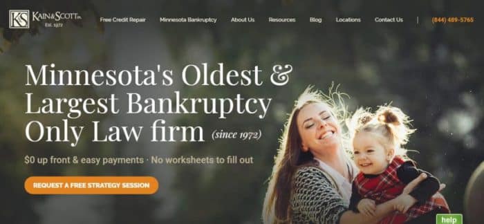 Kain & Scott’s CTA doesn’t only look like a button, but it also isn’t competing with other CTAs on the page. There’s enough space around it to distinguish it as a button and the contrasting orange color pops, instantly drawing attention. The copy is clear, ensuring visitors know exactly what they’re getting when they click it. Kain & Scott have also cleverly incorporated copy just above the button to reduce anxiety, making it clear how easy it is to retain their services.
Bad example:
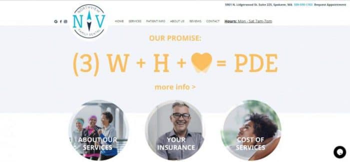 While you wouldn’t know it to look at it, the entire header on Northview Family Dental’s website is a clickable CTA. Although they have some great secondary CTA buttons on their homepage, this one is confusing. In fact, you might almost miss it if not for the ‘more info>’ call to action. It looks like it could be anchor text, but it’s not.
The copy tries hard to be clever rather than clear. The core message they’re trying to convey? Their process ensures patients experience a positive dental experience (PDE).
Perhaps the more serious design crime is that the ‘Request Appointment’ CTA in the top right corner doesn’t look clickable when it is. They’ve prioritized information over lead generation, which is their choice, but it would be interesting to see if conversion rates increase by turning the puzzling formula into a compelling line of copy expressing their promise and adding a button for appointment requests directly below.
Now that you know what a good and bad CTA looks like, let’s dive into top tips and hacks for crafting calls to action that generate leads for your local business.
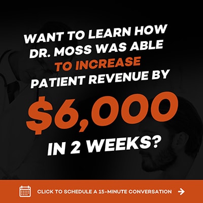 Unfortunately, there’s no magic bullet, one-size-fits all solution when crafting a CTA. Every page has a new goal and with it comes a new call to action.
What a CTA should be is enticing.
For that, you need to understand what your target audience wants and how badly they want it.
You might be inclined to go with ‘Submit,’ ‘Sign Up,’ or ‘Click Here’ because you see these CTAs scattered across the web like they were part of some ‘buy one, get one’ free special.
But these buttons are bland.
And boring doesn’t sell.
Fortunately, there are some basic principles you can follow to craft high-performing CTAs that are bold and appealing.
Before you start, you need to keep three things in mind:
Without further ado, here are some best practices for writing click-worthy CTA copy.
Verbs. Verbs. Verbs. CTA copy cannot live without clear and direct commands. You need to tell people what to do in order to take advantage of your offer. Action words include (but are not limited to):
Notice the juicy verbs in this CTA by CrossFit CEY?
 Although most CTA buttons lead with the verb, it’s not always the case. It simply depends on the copy preceding the button copy.
For example, a dental practice might ask a question relating to their offer and then use the button to create answering copy.
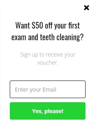 Even if you remove “Sign up to receive your voucher,” the “Enter your Email” copy in the email field becomes the action phrase and the person claiming the offer knows what they’re going to get.
Lastly, the verb you choose should always be in relation to your offer—what they’ll accomplish if they click. If, for example, your button links to an online scheduling calendar, “Book,” “Schedule,” or “Reserve,” would be more appropriate than “Sign Up” or “Create.”
Although “Get Your Free eBook Now” is perfectly fine as a call to action, it’s sometimes necessary to insert prepositions like “to,” “for” and “over,” or articles like “a,” ”an,” and “the.” You wouldn’t say, “Book Class” or “Join Us Free.” These phrases sound robotic. Including prepositions and articles when appropriate will help make your copy flow and sound more natural.
Problem, Agitation, Solution (PAS) is a common, highly effective copywriting formula for crafting just about anything from sales pages to CTAs. It shows your audience you have a deep understanding of the problem they’re experiencing and can help solve it.
Let’s break PAS down:
Problem: Describe a problem/pain point your target audience faces
Agitation: Poke at the problem/pain, conjuring up deep feelings and emotional reactions
Solution: Present your solution
Let’s look at this in the context of a local service business like chiropractic care providers and their key audience.
Problem: back pain
Agitation: the pain prevents people from doing their favorite activities and robs them of quality family time
Solution: a free adjustment
What would a CTA then look like following this formula?
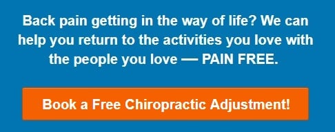 This CTA is much more compelling than “Want a free chiropractic adjustment?” as the preceding text and “Book Now” on the button. It’s also more likely to resonate with the target audience.
To get PAS right, you need to understand your audience’s dominant problem and the implications of it (even if they don’t fully grasp how it’s affecting their lives). Keep in mind you’re not restricted to the short-form version above. You can use your entire landing page to map out the problem, agitation, and solution with headlines, subtitles, paragraphs, bullet points, and supporting visuals.
Using first person (e.g. “I” and “my”) or second person (e.g. “you” and “your”) makes the call to action feel more personal. Consider “Send the $25 facial voucher” versus “Send my $25 facial voucher” and “Get our free tax guide” versus “Get your free tax guide.” The second option in both instances helps customers connect, making the offer feel more personal to them. They have a sense of ownership and they want what’s theirs,
People are hesitant to take action when they don’t know what to expect, which is why specific CTAs tend to have higher conversion rates compared to generic CTAs. Think about how many times you’ve seen a call to action that says the offer is free only to be asked for your credit card details once you’ve clicked through to the next page. People hate being misled, so it’s important to build trust right from the outset.
So, you’re offering a consult? How long is it? Who is it for? What’s it for? What’s it going to cost me?
These are the types of questions visitors to your site will be asking. Anticipate their questions and skepticism, crafting your CTA with specificity in mind.
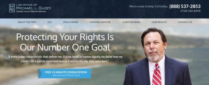
In this example of an Orange County law firm’s CTA button, they’ve included how long the consult is, who it’s with, and the cost (free).
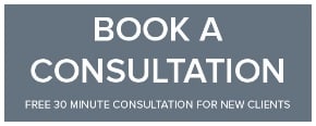
 In this CTA example from Morrisons Solicitors in Camberley, they’ve clarified the duration of the consult, how much it costs (free), and who is eligible (new clients).
Check out this whopper of a CTA from a Perth-based building inspection specialist:
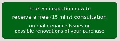 Specificity is great but not at the expense of brevity. Be sure to strike up a good balance, using simple statements containing ten words or less for button copy. You can position the rest of your message before, after, or to either side of your button, but the most actionable language should be used on your button. Remember, visitors to your site are often making snap judgments about staying, bouncing, or clicking. You want them to be able to read and evaluate your CTA quickly.
Want to know why “Contact Us” is one of the poorest converting CTAs? It’s because it doesn’t express the benefit or value of the offer. Why should your target market contact you? What’s in it for them?
When crafting your CTA, you should always think about your value proposition and the underlying drivers that make people act and behave in a certain way. Essentially, you want to understand the “why.”
Here’s an example from Sunglass Warehouse:
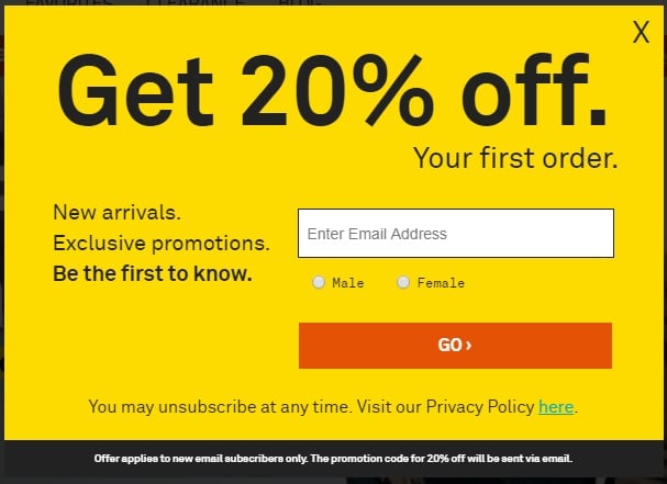 The value is right there in the headline. But Sunglass Warehouse takes it a step further, identifying additional benefits. Now customers know that when they part with their precious email address, they’re not just getting a coupon code, but they’ll also be the first to know about new arrivals and exclusive promotions. This call to action explains exactly why they should sign up and frames the offer as being low risk, high reward.
This is the reason CTA buttons with the word “Free” in them are so enticing. They add a point of value. Compare “Download your ebook” to “Download your ebook for free.” Which one would you be more inclined to click?
In this example from Fresh Faced Skin Care, they include what the prize is and the value of the prize in their CTA:
 If you’re a gym owner, you could get people to “Sign up for a 14-day free trial. No credit card required.” Whatever kind of business you own, it’s crucial to make the payoff clear.
It’s amazing how tacking on a simple word or two word phrase can instantly change the feel of your CTA, but it does—and the rewards are sweet.
Creating a sense of urgency or scarcity can persuade users to convert sooner rather than later. While there’s a chance a visitor might return to your site, there’s no guarantee. As a result, you need to drive visitors to take action when you have their attention. In addition, some words denote instant gratification (i.e. they’ll get their inducement right then). This especially works well when your offer is something like a digital download. “Download Your eBook Now” is stronger than “Download Your eBook.”
Urgent words and phrases include:
Scarcity words and phrases include:
(Note: We wrote an entire post on how to create a Facebook Ad campaign driven by urgency. Many of the principles detailed in that post apply here, so check it out when you have a moment.)
Using language that evokes curiosity is a powerful technique for converting visitors into leads. Words like “secrets,” “surprising,” and “unusual,” are emotional triggers that drum up a desire to find out more.
Let’s evaluate this example from Fat-Burning Man:
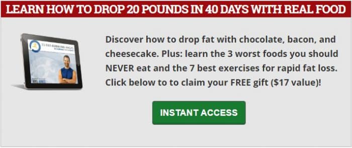 If you want to lose weight, you’re going to be asking questions:
This CTA does an excellent job of rousing curiosity in its target audience. The only way they’ll find the answers is if they sign up for instant access (i.e. instant gratification).
(Note: Just as we did with urgency, we wrote an in-depth post about how curiosity can exponentially boost inquires for your local business when used in a campaign. Pop it on your reading list.)
People want to feel part of an exclusive club—like they belong. It’s built into our DNA, which is why we feel connected when we see others who have similar values, morals, interests, and ideas. It’s why social proof works so well. If they have it, we want it or want to be part of it.
Here’s a perfect example of a CTA by Content Marketing Institute that evokes a sense of belonging:
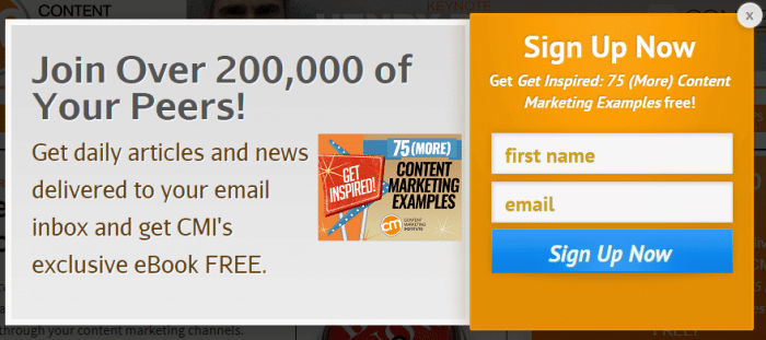 Anyone seeing language like “Join Over 200,000 of Your Peers” will feel a sense of validation in their choice to sign up because so many others have done it.
(Note: As luck would have it, we’ve also extensively covered the complex psychology of belonging in our post on mutual-love-and-respect ads. Although it’s written in the context of increasing and protecting a local business’s profit margins, there are some awesome tips that would translate well to lead generation CTAs. Be sure to give it a read.)
Even when your offer is free, there might still be perceived risk. As a lead moves further down your sales funnel, you’re going to ask them to make bigger commitments until they finally convert into a paying customer.
People aren’t stupid. They’re more aware of the buying process than ever before, which is why it’s necessary to start countering objections and reducing anxiety as early as possible. Sometimes that begins with the CTA for your lead magnet.
Here’s an example from Malman Law:
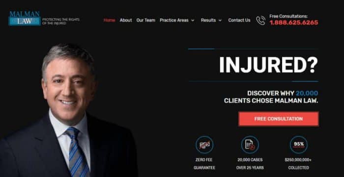 Besides including social proof (over 20,000 cases handled and $250 million collected in court case victories), Malman Law establishes their zero fee guarantee upfront. Now anyone who is considering the firm’s services knows that they won’t have to fork over their life savings to get their case started. The free consultation offer also reduces perceived risk because they have an opportunity to figure out whether the firm is the right fit for them before they move ahead.
Objection-crushers like “no credit card required,” “cancel at any time,” “money-back guarantee,” “no paperwork,” and “proven results,” will ease the minds of your prospects and boost conversions. Testimonials are also great for this. The objective is to show visitors how easy it is to take action and work with you.
Button icons, graphics, and directional cues like arrows clarify what your visitors will receive and what they need to do to get it. For example, you might use a calendar icon on a booking button, a ‘play video’ icon on a view button, or a download icon on a download button. These special elements attract attention and help increase click-through rates.
Check out the guide graphic and directional cue in this example from Teamwork Financial Group:
 Each element works to drive more signups.
The design and flow of your CTA and lead generation funnel should create a smooth user experience (UX). If your call to action implies that the individual will have to sign up on the next page, then the next page should follow through in providing a sign up form.
Final quick-fire tips to ensure your CTAs rock your conversions:
You should position CTAs in high-visibility, high converting locations. Although you’ll need to monitor traffic and assess your CTA’s performance, here’s a list of popular places and pages:
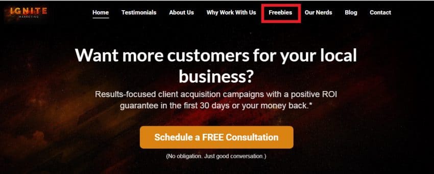
For our secondary CTA offer, we created a “Freebies” tab:
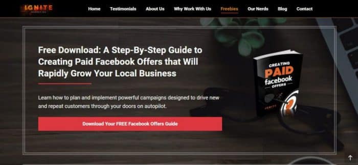
 When you click it, the page scrolls to our ebook offer:

Here’s an example of an in-post CTA for our free guide:
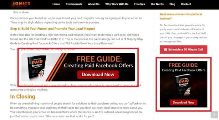 You’ll notice that we’ve also included it in the side bar of our blog. While our homepage CTA, blog post CTA, and sidebar CTA are all for the same offer, they’ve been strategically designed to suit their location.
Ultimately, placement and design can heavily impact performance. Each new spot is a new opportunity to attract people into the top of your funnel, which is why CTAs should have logical placement (i.e. where people will see them).
Now that you know how to craft a crazy-effective call to action, it’s time to dive into landing pages.
A dedicated landing page provides a variety of benefits, giving you more space to flesh out your offer, creating a better user experience, broadening opportunities for your target market to find you via search engines, creating opportunities for people to link to your page, and boosting your authority and search engine rankings. In addition, tools like ClickFunnels and LeadPages make landing page creation super easy, and they’re not prohibitively expensive.
But…
Often referred to as a lead capture page, a landing page is a single web page that appears in response to clicking an online ad, search result, or CTA button. The page will contain content or copy related to the link or button pressed. It should describe the offer, include relevant graphics, and persuade the user to complete a signup form.
The designs of high-converting landing pages run the gamut from simple to complex, but they all have several key components. Before we look at those more closely, it’s important to keep in mind your landing page must be dedicated to helping you achieve your conversion objective. It should focus on one target customer, one offer, and one promise. Pages with competing messages and too many shiny objects are destined to fail, as are those that don’t correlate with the CTA previously clicked.
What should you aim for when creating your landing page?
Here’s a fantastic landing page example from Alberta DUI lawyer, Alan Pearce:
 This next landing page example is from a successful free dinner campaign we ran for one of our chiropractic clients. It’s a great offer for many local service businesses. Simply adapt the topic of the presentation to suit your industry.
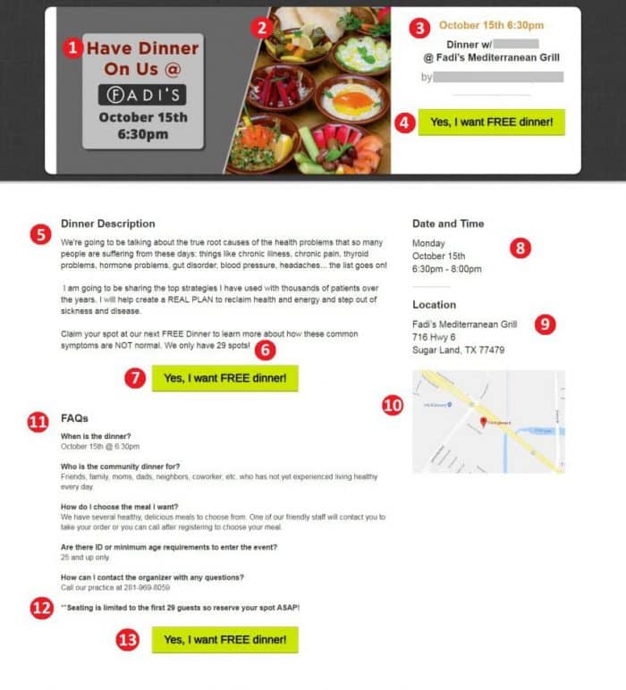
Take notice of how the page has no links leading to additional website pages or external sites. The message is clear and cohesive. The design is clean and professional.
You can find additional landing page examples in our post on generating leads with high-converting guides, but the reason we wanted to share this dinner funnel with you is because we’re making it available for free through ClickFunnels Share Funnels.
Sign up below and we’ll send the link right to your inbox.
When someone lands on your landing page, you’ll want to provide an opt-in form where they can enter their details to join your email list and receive your offer. Forms are crucial in funnel creation because it’s the tool that facilitates the lead conversion. Prospects essentially give you consent to contact them with additional information.
Forms can be set up in a number of ways, but the most common are embedded forms and popup forms. If you evaluate our two landing page examples, you’ll notice that the law firm’s page makes use of an embedded form while our chiropractic client’s page makes use of a popup. How you set up your funnel will initially depend on your preferences, but you should split test various versions to see which one generates higher conversion rates. How you set up a split test for your forms will depend on the form builder you’ve chosen and its capabilities, so be sure to check out your provider’s instructions.
The reason we use the popup form is because we find it reduces friction. Lead capture pages request something from your prospect, which can create a psychological roadblock. By using a two-step opt-in whereby users have to click the call-to-action button before the form appears, we effectively eliminate potential resistance. Clicking the CTA button starts a process in the mind of your prospect—they’ve given you a little “yes” and now they’re more invested in completing the action.
But what elements should your opt-in form include?
To further limit friction, you want your top of funnel forms to be as straightforward and short as possible. Building trust takes time, so you don’t want to be too demanding on a new prospect.
However, there are instances when you’ll require additional information based on your offer. Asking people to answer certain questions or choose a relevant option from a dropdown menu can help eliminate tire kickers and produce a better quality lead. People who are “just looking” or aren’t overly interested are less likely to sign up if you’re making them do what they perceive to be more work. In addition, questions can help you further qualify your lead so that you’re not wasting your time or theirs. For example, let’s say you’re an estate agent who only sells luxury homes. You might include a question about price ranges directly on the signup form so that you can filter out those who aren’t in your target audience and nurture those with the right spending power.
Remember the Northeast Portland Chiropractic Center example at the beginning of this post? This is what their lead form looks like for their free exam offer:
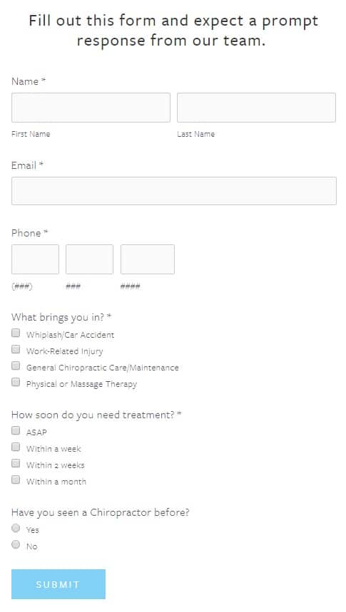 The form allows them to collect additional information about their prospective patient without being overly time-consuming.
A good lead form should include:
Here’s what the form for our chiropractic dinner looks like: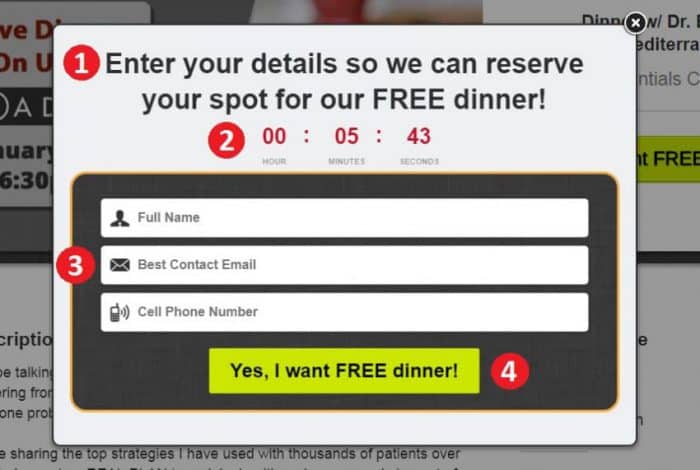
Once a user clicks that final button, you’ve netted yourself a brand new lead. But this isn’t where the journey stops. You’ll need to redirect leads to a “Thank You” page.
Often viewed as the least important component in a funnel, most business owners and marketers tend to neglect Thank You pages. However, they symbolize a pivotal moment in the buyer’s journey. A visitor has stopped being a casual browser, converting into a qualified lead with a deeper interest in what the business has to offer. There’s still work to be done and these pages offer prime real estate to do it.
Let’s say someone just converted on your ebook. How do they access it? Is there another action they should be taking to move further down your funnel? Is there a way they can help you generate more leads?
Just like every other piece of your local business’s lead generation funnel, your Thank You page demands optimization.
Here’s a great example of a Thank You page by Wright Fit Physiotherapy and Fitness:
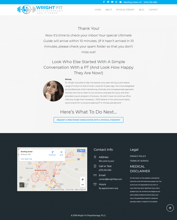 After signing up for their ultimate guide on neck and shoulder pain, leads are told where to access the ebook. They’re then shown a testimonial and told what to do next, which is request a free phone consultation with a physiotherapist. There are also social media buttons and a menu bar at the top of the page, giving leads the option to connect on social platforms or explore the business’s blog and services.
Now let’s assess the Thank You page from our chiropractor’s dinner campaign: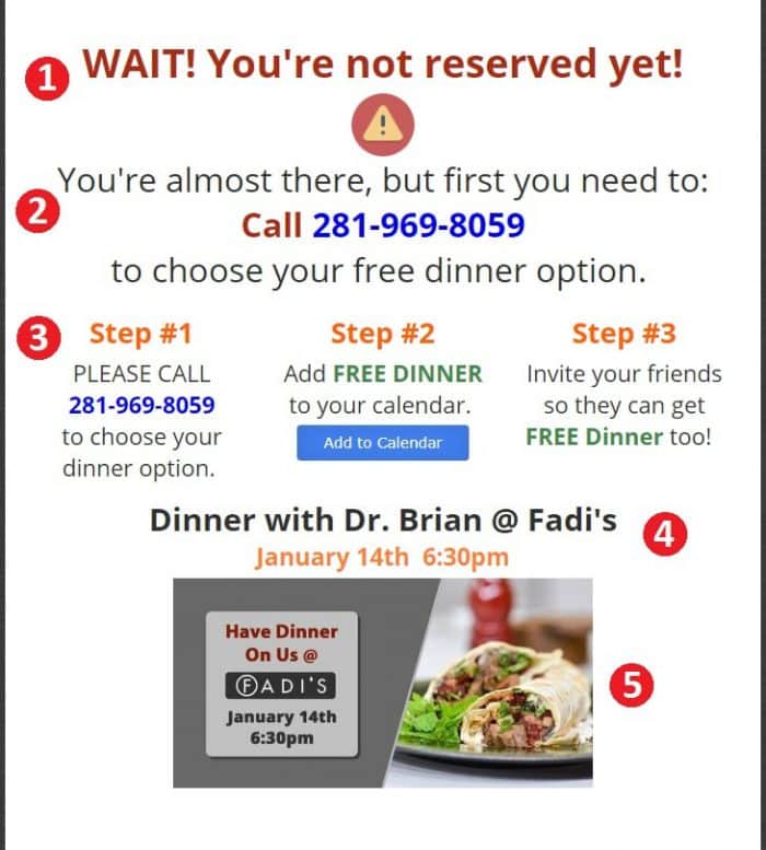
Once a lead claims your offer, they’re on your email list. This creates an opportunity to start a two-way conversation so that you can nurture the lead into a paying customer. If you haven’t clued in yet, this brings us to the ‘Close’ phase of the inbound marketing process, which is what we’ll cover in our next post.
In the meantime, start planning and implementing your lead generation funnels. You’ll want to keep tracking and testing in mind so that you can fully optimize them when they’re live and you’re seeing results.
How have you been generating leads for your local business? Which tactics have you seen work best? Share your tips and strategies with us in the comment section below. Don’t forget to grab our free dinner funnel and add it to your own campaign arsenal.
Read more from the series...
